Following the selection of a woman to head General Motors, there’s been some brouhaha on Twitter in reaction to the publication of a graph by Reuters (with data from Catalyst.org) followed by the redesign of JK Keller (retweeted 1500 times as of this writing). Here are the two.
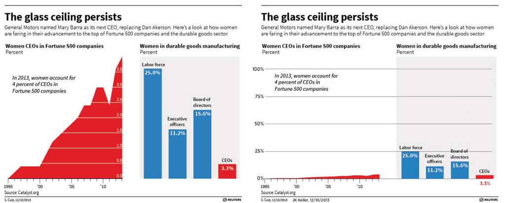
While most applauded the redesign for showing the true scale of the women’s progress, Alberto Cairo suggested a different approach that would preserve the prior scale while making the data clearer. His objective was to show the detail of the rise in women CEOs of Fortune 500 companies.
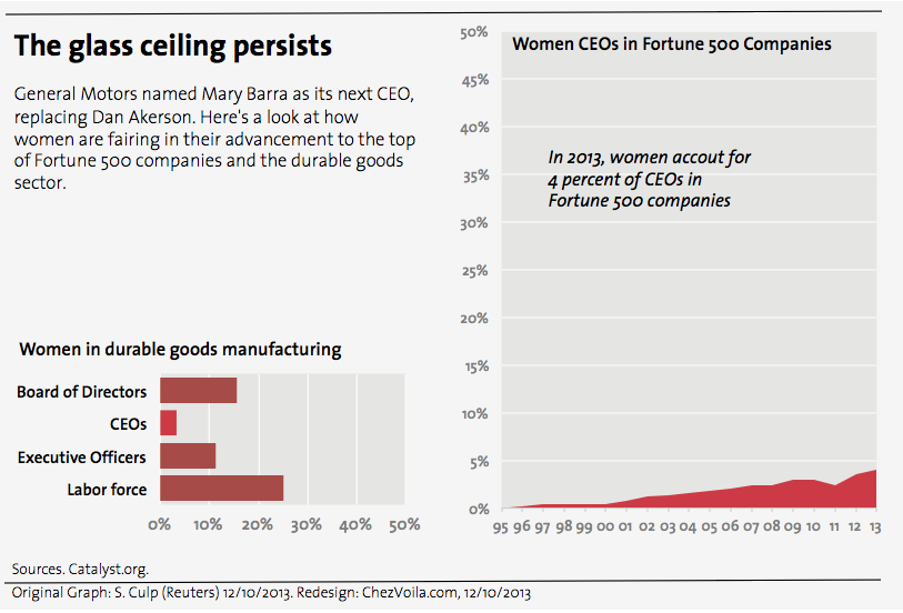
My main design issue was that the data point in the middle — Women CEOs in Fortune 500 companies — relies on the left for its definition and the right for its scale, which is likely too unusual for the average reader to notice. I know I was fooled by it. Cairo explained that he didn’t have the time to create a separate scale, but sticked to his guns that the scale should maximize the visibility of the rise. I think it exaggerates the rise and we need to show its true scale, in line with the title of the graphs.
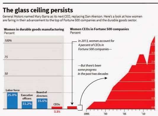
I proposed using a 50% scale and Cairo suggested that someone test this approach. I had just volunteered myself. Here goes.
This redesign is more radical than the previous two. I didn’t stick to the original look and feel for lack of time, but mostly I wanted to test a few things.
The scale is 50% because that’s the theoretical target in a gender-neutral world. This happens to be a compromise between showing a scale that fits the data (4-5%) and one that shows the entire realm of possibilities (100%).
The graph on the “share of women across levels” is now horizontal because it represents a hierarchy. One wants to see as many women “at the top” as men. This now recreates this sense that there is a top and clearly shows that the biggest issue is at the CEO level. Of course, the Board of Directors are above CEOs and other executives, as they elect them.
The colors are two shades of red to diminish the distinction between the CEOs and the rest. The color coding in Reuters’ original was meant to link “women CEOs” across the graph, but it so links two different data sets (Fortune 500 vs. durable goods companies). I felt there is more in common between “women” in the two charts than warrants the use of a different color. My initial reaction was to look against what women were compared, until I realized they weren’t. Still, to preserve the link between the two charts (CEOs), I used a lighter shade of red in both cases.
I dared to remove the exact numbers, though increasing the level of precision of the gridline, in part to draw the attention to the data made visible by the graphs and in part because Excel just wouldn’t do what I wanted and it was getting late, I’m afraid.
May this imperfect redesign contribute to the discussion about proper scale. In any case, it’s been great to have so many exchanges about women CEOs. The data suggests that we need more.
Update: More explanations on the choice of scale and gender-neutral data visualization.