Data is numbers reflecting a reality. In the debate about the Reuters graph, there seems to be two schools of thought: those who want to represent the numbers and those who want to represent the reality.
The numbers are clear: the proportion of women CEOs went from 0 in 1995 to 4% in 2013. From the 0.2% of 1996, it’s a twentyfold increase. Woah, right? The trend is positive, with a rapid rise, and women are finally accessing positions of power in business, right?
Not quite. At this pace (3.8% increase / 17 years = 0.22% increase per year), women will achieve parity in 200 years. This reality cannot be represented as a steep upward slope. It’s a disaster of flatness. In fact, we don’t even know what the numbers were before 1995 (and I can’t find them). If it goes above zero at any point, it makes the current situation look worse.
A graph that visually contradicts its message impedes understanding. In the case of Reuters, the title says “The glass ceiling persists” but the graph shows a steep slope upwards. The scale at 3.5% is footnoting, fine-printing a visual. The Stroop effect told us some 80 years ago that it’s not a good idea, that people will be either fooled or confused by it. The graph with a 50% scale does not hide this increase: it shows it to its real scale.
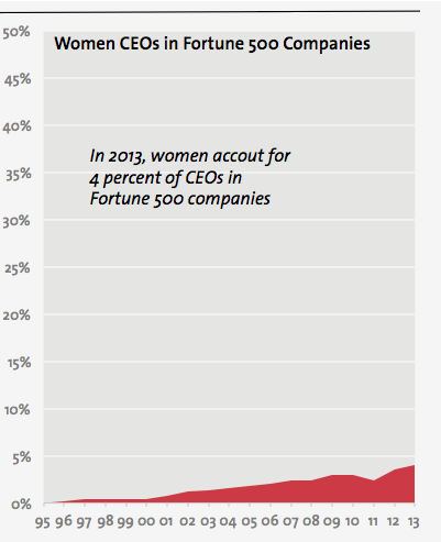
Using a small scale allows to see the details. That’s true. But is this data about the 0.6% dip in 2010? It’s not and, in fact, the dip is quickly canceled the following year. This is visible in the graph with a 50% scale, just less, as should be.
Gender-neutral data visualization
Women should, in a gender-neutral world, occupy a proportion of CEO positions similar to their proportion at birth, given that what differentiates them physically is not required to exercise the responsibilities of a CEO. And if you think that men are predisposed to exercise leadership, I invite you to study matriarchal societies.
The fact is: in the last 20 years or so, women have made very little progress towards equality in CEO positions. It’s not a story about a twentyfold increase, it’s about a 4 percentage points increase. In 18 years.
I try to remain very careful when treading around issues that affect other people. We’re all on the receiving end of something and that’s often when we realize that the dominant group has no idea of what the other side is going through. In this case, as a man, I want in no way to diminish the difficulties of 50% of the population to occupy a similar proportion of business leadership positions — with the prestige, money and power associated with them. In fact, I’m yet to see a woman say that the Reuters graph was correct.
By default, I lean on the side of representing reality in graphs. If it’s small in reality, it should be small on your graph. If it’s varying little, it should also vary little in your graph. Yes, there are exceptions to this, but this is not one of these cases. It’s a loss for humanity, not just women, that we have so little diversity at the top of large businesses. We should all be outraged about this and our graphs should show that the situation is outrageous, much like the title of the Reuters graph did.
Francis Gagnon is an information designer and the founder of Voilà: (2013), a data visualization agency specialized in sustainable development.