While we hold that bar charts should start at zero, there is no such expectation for line charts. But you’ll always find someone on social media to denounce a “dishonest” line chart that enhances the variations by truncating the y-axis. There is usually ample pushback, but it often leads to the question: Where should it start then?
The simple answer should be: low enough. As I wrote in this tweetstorm (I should have blogged), the scale is a matter of context and it’s hard to make a rule without knowing the data and the reality. It should be low enough so that the perception of the graph is close to that of the reality it seeks to represent.
But that sounds too vague and people love rules, so I’m turning it into one:
The bottom third of the plot area should remain empty for a line chart that doesn’t start at zero.
Now let’s see why.
Here is a data set with high numbers and relatively low variability plotted on a line chart with a scale starting at zero.
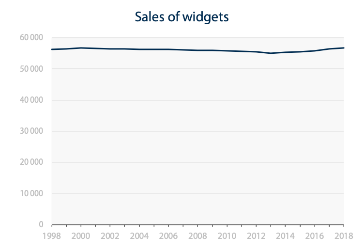
Seems like not much happened in the last 20 years because the full scale hides relatively small variations (which may be the point, but that’s for another time). It is nearly useless as a visualization and a table would tell us more.
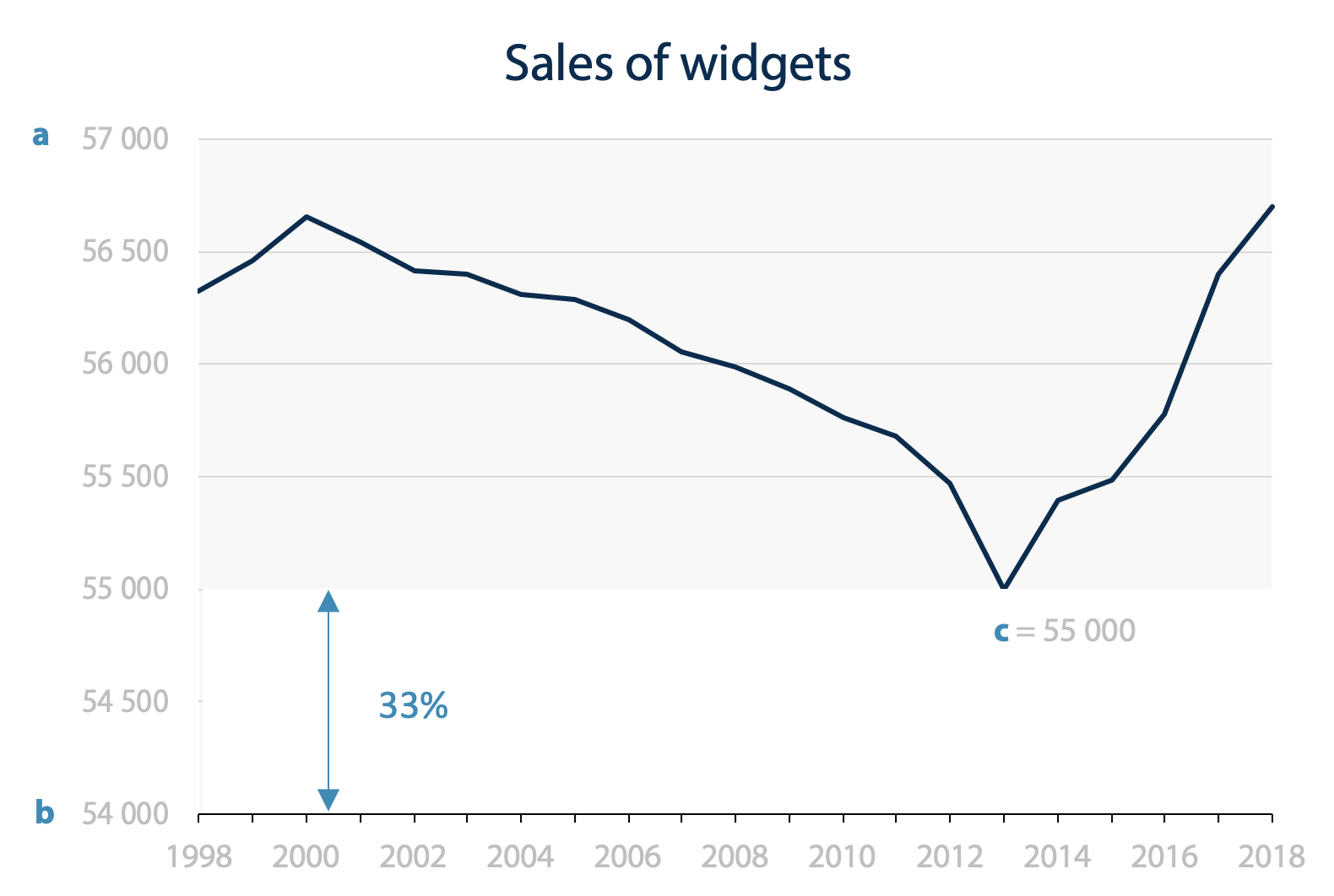
Now let’s go to the other extreme and set the minimum value of the scale at the minimum value of the data.
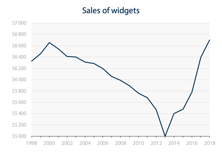
At first glance and not in a post about scales, you would think that the widget sales crashed to zero before going back up. That is, until you read the scale and realized that it starts at 55 000. This misperception is a kind of Stroop effect. Based on your experience of reality, the baseline of a chart appears to be ground zero when it is visually used like this.
We need a middle point. A range that is small enough to show variations, but with a starting point that is low enough to avoid the misperception that the data reached zero. That’s where I suggest that we design the range and the starting point so that no data appear in the bottom third of the plotting area. It looks like this.
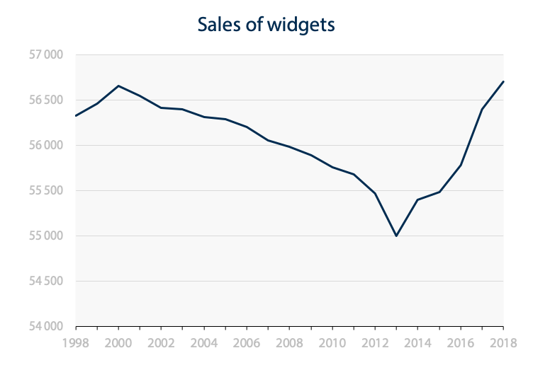
Why one third? Perhaps because it’s the golden ratio, where the empty space at the bottom is one half of the graphing space at the top. It also corresponds to the rule of thirds in visual arts. By following this rule, two thirds of the plotting area are dedicated to the data and one third to the secondary fact that the line is floating into space far above the ground. I believe that data visualization has a lot to learn about older arts, languages and other practices and this just might be one example.
And finally, according to a few quick tests, it seems to be the default on MS Excel, so maybe they took it somewhere (although it sometimes truncates the y-axis for bar charts too).
Compare this with an empty space at 20% of the plotting area (which was my initial suggestion before I started testing and thinking it through).
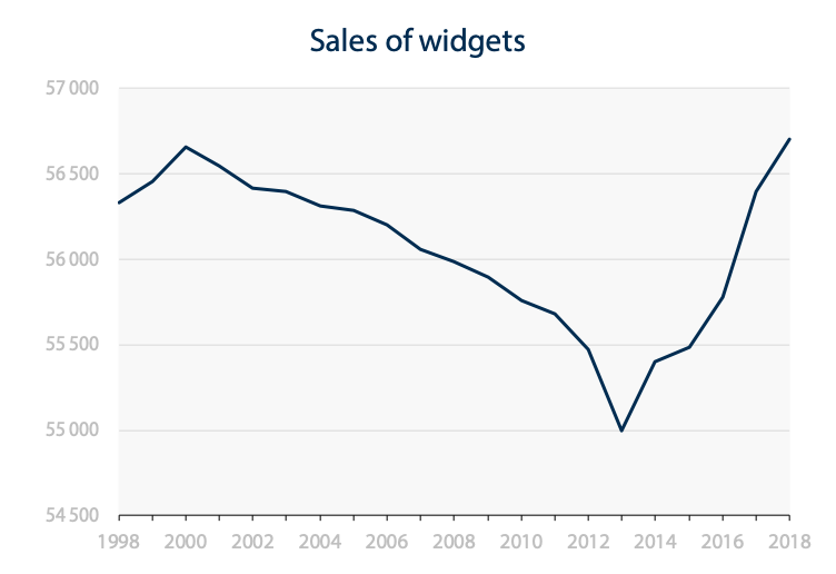
It is a matter of judgement, but it does appear that the line veers very close to the bottom, like a plane that’s flying too low. The eye is drawn to the baseline and the perception of ground zero is triggered again. One third seems to preserve enough space so that our eyes don’t go to the baseline and connect it to the data line.
Now, I would need 37 random students from the University of Austin to test this and truly turn it into an unimpeachable truth, but in the meantime we can say that we apply the golden ratio.
Now with annotations and calculations.
Here is the formula to calculate the value of the scale.
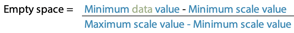
Expressed in algebra:
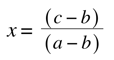
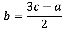
And here is the minimum value of the scale (b) isolated:
In my example, it works like this:
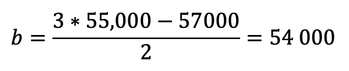
So my scale will end at 57,000 and start at 54,000.
Thanks to my friend Robert Couillard, Eng., for isolating b more elegantly than the calculator did.
Thanks to Lisa Charlotte Rost for prompting me to think about this a little further and write about it when I tweeted something in jest in response to a Datawrapper update.
Interesting! Can you explain why (and for who) you think that would be helpful?
— Lisa Charlotte Rost (@lisacrost) December 6, 2018
This blog post was quoted by The Economist in their review of their data visualization in March 2019, by Calling Bullshit in their suggestions for choosing axe scales, and the golden ratio is now a default in the JMP GraphBuilder.
Francis Gagnon is an information designer and the founder of Voilà: (2013), a data visualization agency specialized in sustainable development.