In a way, this blog post started over 15 years ago when I studied inequality and the United Nations’ Human Development Index. So, naturally, the data visualization challenge about inequality announced by the UN caught my eye. It seemed like the perfect opportunity to collaborate with Erica, a recent graduate of the computer engineering program at Polytechnique Montreal, who came to work at Voilà for a few weeks. We could discuss the topic, iterate on the concept and Erica could practice her programming skillschops.
The final project is available here and below is a presentation of our process. The code is available on GitHub.
– Francis
by Erica Bugden and Francis Gagnon
Inequality is both numbers and reality: abstract enough to be invisible, but real enough to be experienced. A perfect topic for a visualization.
The UN wanted to make these numbers more real for a global audience using visualizations with some interactivity so that viewers would engage with the data themselves.
So here is our process and how we went from one concept to another, changed our mind, went back, took too long to find obvious solutions and ended up with a final product that could never really be final.
Getting started: Brainstorming and sketches
From the start, we knew that we would focus on economic inequalities. We had to keep it simple because of our limited means (two people with other (paid) things to do) and time (two weeks). Here are a few ideas that we sketched as we were thinking out loud.
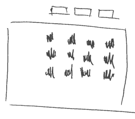
Panel charts allow for a high density of visualized data without the presentation becoming too noisy. They also allow for reasonably good high level comparisons between different countries. With so many countries to compare, it could be a valuable technique.
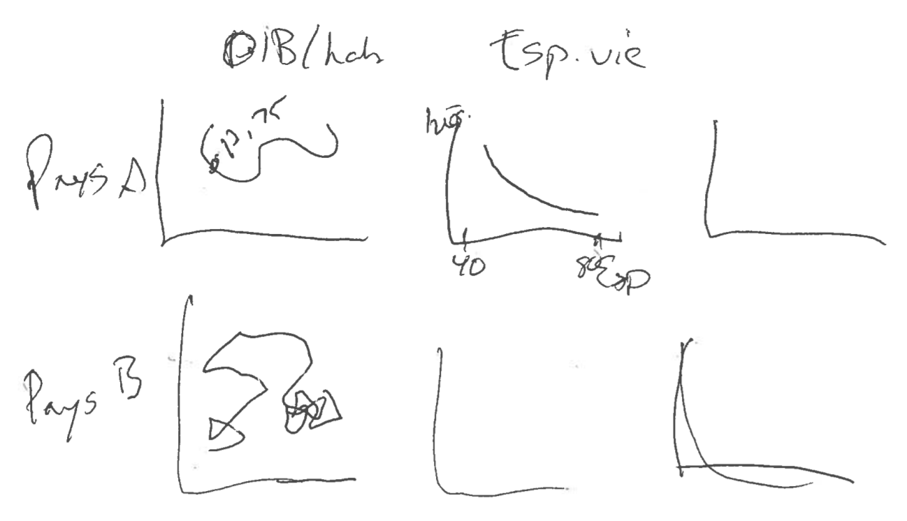
It can also be interesting to combine several types of plots or measurements to get a more complete picture of each country.
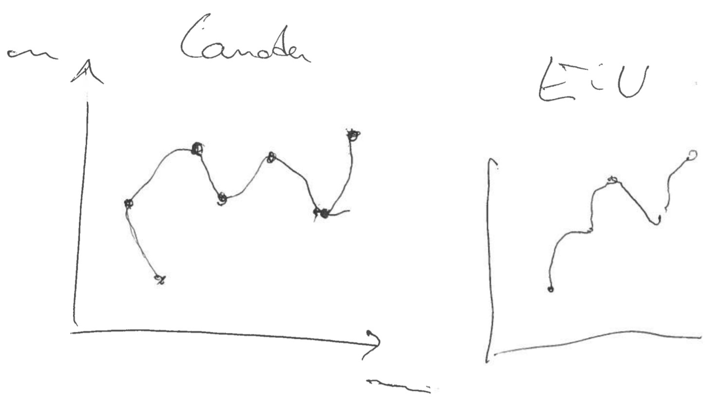
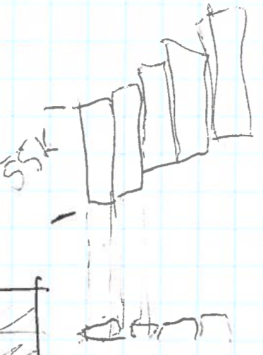
We explored a couple different chart designs for showing the evolution of inequality, including a connected scatter plot showing the relationship between inequality and growth over time, inspired by the work of Hannah Fairfield and Alberto Cairo, but we eventually gravitated towards a series of bars.
Sequential bars could show the evolution of disparities while keeping time as the horizontal axis. This could make the visualization more intuitive because, when showing an evolution, time is often assumed to be the horizontal axis.
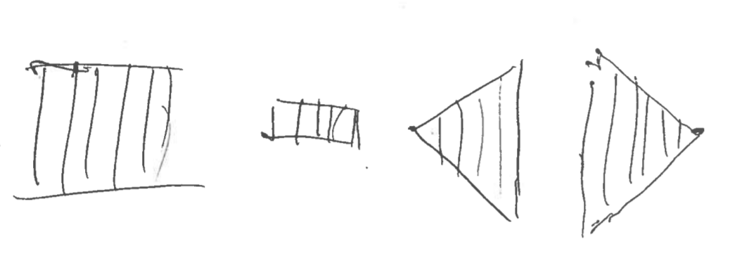
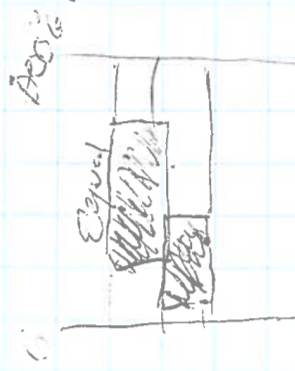
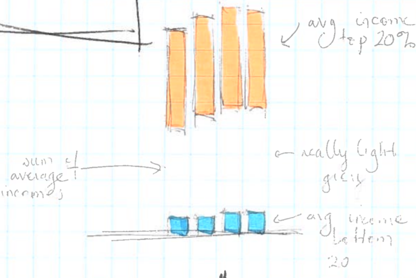
Quintiles are the five equal groups into which a population can be divided based on a particular variable. They are often used to compare richer and poorer groups when discussing economic inequalities.
We thought it would be interesting to show the evolution of the income share of each quintile by stacking the percentages owned by each group. This sketch shows two years of data for a given country. The scribbled values are just us trying to make sense of the numbers.
We initially leaned towards showing the evolution of the proportion owned by the three middle quintiles and having the top and bottom quintiles invisible. It would create floating blocks that could be visually interesting. The smaller the block, the higher the inequality.
However, doing the opposite, that is showing the top and bottom quintiles, seemed more relevant to focus on the inequality between the richest and poorest. The eye could compare the height of the top columns to that of the bottom columns, and their respective evolutions of course. We were getting somewhere.
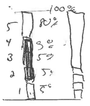
We had a concept for visualizing shares, but it didn’t show how relatively rich a country is, limiting the usefulness of international comparisons in our panel charts. So we thought we could add annual income to our graphs, adjusted for purchasing power parity.
These bars can be stacked in the same way as the income percentages except that, in contrast with the percentages of income which always add up to 100%, the total height of the bar has no meaning (it’s only the sum of the five quintile averages). If comparable currency is used to calculate the average income, then the salaries in a poorer country will be visibly much lower than those of a richer country.
At this point, we felt that we had our concept down and we were ready to start playing with the data.
Data processing
All the data processing in this project was done using Python scripts. The data was sourced from the World Bank Open Data database, to which the UN database was connected. Describing the income distribution meant we needed to know the following tidbits of information:
To be able to calculate the annual incomes for each quintile we also needed to know how many people were living in the country and how much money the country was making:
As is often the case when playing with data, we quickly saw the datasets’ limitations, especially in terms of completeness (thankfully, World Bank data is as good as it gets in the real world) so we had to make choices.
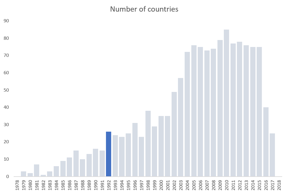
Given that inequality data became more available over time, we had to choose a cut off date at which to start our visualization. So, we created a histogram in Excel showing the number of countries included in the database per year. We choose 1992 as the start date because of the drop in numbers before that and that it would give us a nice round 25 years of data.
The second issue was that some countries simply didn’t have a lot of data available during that period. We wanted to have enough data in each country to see representative trends so we decided that 10 years of data was a strict minimum. This led us to exclude some (normally) data-rich countries like Canada and Israel as well as large ones like India.
With this, we had our concept and our data. We were ready to start visualizing.
Prototyping
Having already developed a concept on paper, we made some quick visualization prototypes using the real data and Plotly’s Python graphing library in order to get a feel for the effectiveness of the different options.
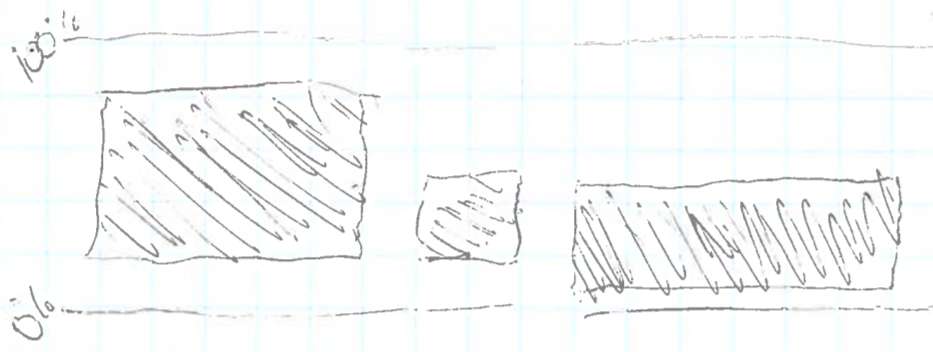
Income share, version 1 (bad)
We started with some ideas that turned out to make little sense once we saw them. One of our first shots in the dark shows the top quintile’s income share with an invisible cutout at the bottom corresponding to the bottom quintile’s share. In practice, the length of the blue bars shows the difference between the shares owned by the top and the bottom 20%. But the top of the bar really only shows the top 20% share.
The result is a bar that floats but the floating is barely visible in countries where the poorest have a very little share.
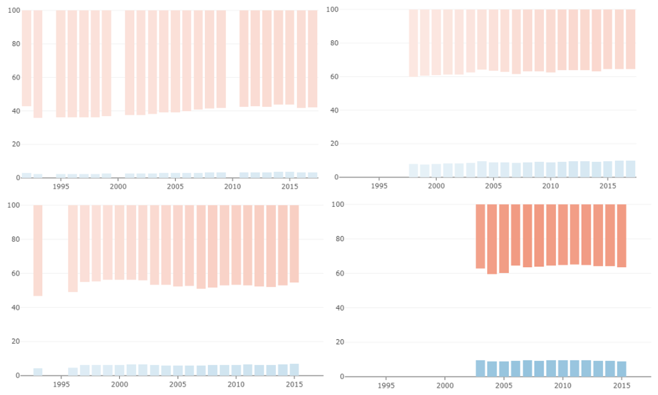
Income share, version 2 (good)
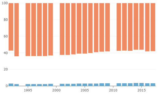
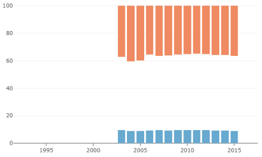
Here we show the distribution of income (%) in terms of percentage between the top 20% (orange), the bottom 20% (blue) and the middle 60% (the space between the orange and blue). This would be our basic design going forward.
Average incomes
Here, we show the average income ($) for that year of the bottom 20% (blue), the middle 60% (invisible) and the top 20% (orange).
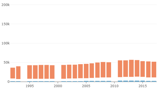
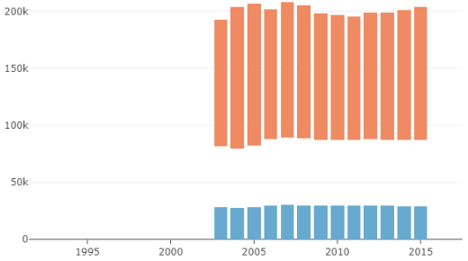
In this second design, we have an idea of how rich the country is in comparison to other countries, but it is difficult to understand the distribution of income within the country. Also, the total length of each stack has no particular meaning apart from giving an idea of how rich the country is.
Both seemed interesting and the challenge called for interactivity, so we eventually decided to show both thanks to a toggle button.
Developing the design
Some might have already recognized our divergent color palette from ColorBrewer. At this stage, we wanted something that would just work, knowing that we would later adjust it for aesthetics. But first, we wanted to experiment and see if we could effectively encode both share and levels of wealth in the same graph.
Lightness for income levels
First we tried varying the lightness of the bars based on a single scale that varied linearly from the minimum measured income to the maximum measured income out of all the different countries. Lighter bars meant that a country was poorer while darker bars meant that a country was richer.
We found that because the differences between the incomes of the richest and the poorest countries are so big it was too difficult to see the evolution of the income individual countries when using a linear scale because the changes were so slight.
Lightness for income groups
Since a linear scale made the changes too subtle we tried using a discrete scale instead. More specifically, the bars were colored based on the country’s World Bank income group classification which splits countries into four income groups: low, lower-middle, upper-middle, and high.
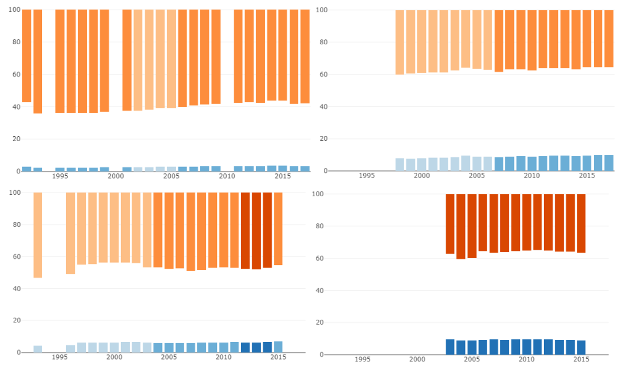
This approach shows the changes in income group of a particular country and can be compared with other countries. One minor issue with this iteration was that the dark orange used for the rich countries looked red which had a negative feel even though a country having high income is not fundamentally negative.
Red line for a threshold
We also wanted to incorporate more visual references to give viewers a better idea of whether or not a country had a reasonable distribution of income.
First we tried the simple solution of placing a red line so that it is easy to see if the top 20% had more than 40% of the income.
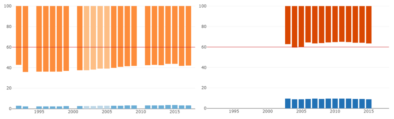
However, this does not solve the problem of the rich countries looking red. Also, it draws a lot of attention to this made-up threshold.
Color for concentration of income
For this iteration, we added another nuance to the lightness of the income groups. We used colour to encode the concentration of income, duplicating the encoding in the bar length. Purple bars mean that the top 20% had less than 40% of the income. Lightness still refers to income groups.
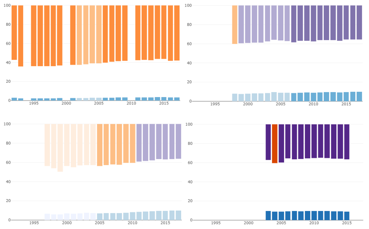
This representation was too difficult to understand and to read. The colour lightness scale represents the income group of the country, but confusingly the hue change from orange to purple indicates having passed an income distribution threshold which has nothing to do with the country’s overall income. Additionally, the colour changes can look really drastic when a country briefly dips below the inequality threshold even if it is just a slight variation.
Finally, we also abandoned the idea of using bar colour to show inequality between countries because we couldn’t find a representation that felt sufficiently intuitive.
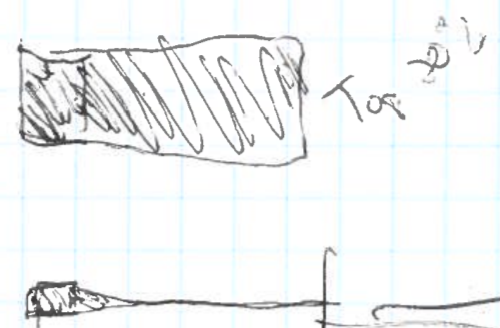
Some other fill options
Here are some other fill options that were considered for showing the severity of the inequality. All of them rely on some visual transition at 20%, 40% and 60% of income concentration. In the example on the right, the color changes at 40% because it means that the richest quintile has more than twice its equal share of income.
In the end, it did not seem right to define a firm but arbitrary threshold for acceptable inequality. We wanted something that would be more neutral in terms of judgement, but that still helped people quickly and intuitively evaluate the severity of the inequality.
Colour as grid
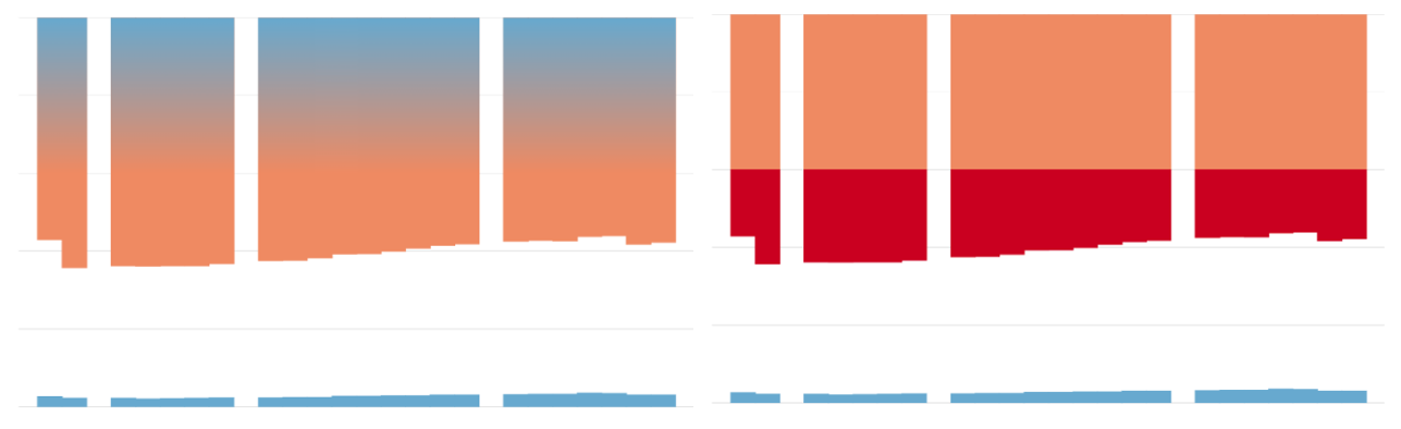
Our solution was to simply add more reference lines. We used the colour of the bar itself to show the severity of the inequality. This approach quickly draws attention to where inequalities are more severe.
In this first version, the colour of the top 20% section of the bar is blue from 0% to 20% to mirror the blue used for the bottom 20% and changes from orange to red when the percentage owned by the top 20% surpasses 40% of the country’s overall income.
Lovecraftian programming
We have very minimal web programming experience and this will probably be apparent in this section as we attempt to describe a few of the technical details concerning how the visualizations are implemented. It’s important to note that during the development process we made frequent use of the following reference books:
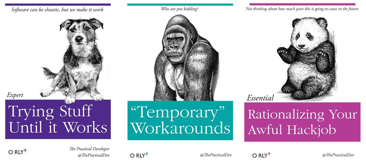
… usually in that order. All that to say that there are some unspeakable horrors in the code that would probably drive Lovecraft himself to madness.
The final individual charts are generated using the outdated third version of D3 (they’re at version five now), while the rest of the chart layout and the chart toggle is just plain old HTML, CSS and Javascript. We used this older version of D3 for the predictable reason that this is the version used in the example that inspired much of the code and we didn’t get around to figuring out what changes were needed to implement it in a more recent version of D3.
When the transition was made from prototyping with Plotly to using D3, the Python scripts used to process the data were adjusted to organize the data into JSON objects that could easily be plotted with D3. Not having to manipulate large amounts of data in the browser makes generating the visualizations faster.
The “temporary workaround” present in the final code that is arguably the most interesting is what was used to colour the top 20% bars. In brief, the colour of the bars is defined using a linearGradient element. By specifying that a transition starts and ends at the exact same position you get an instantaneous colour switch and each colour switch in the bars (including the “gridlines”) is a transition that is specified in this way. Here’s what defining the blue and orange bar sections looks like in the code:
        // Define bar colors in the most elegant way possible...
	gradient
		.append('stop')
		.attr('stop-color', blue)
		.attr('offset', '19.5%');
	gradient
		.append('stop')
		.attr('stop-color', gridlineColor)
		.attr('offset', '19.5%');
	gradient
		.append('stop')
		.attr('stop-color', gridlineColor)
		.attr('offset', '20%');
	gradient
		.append('stop')
		.attr('stop-color', orange)
		.attr('offset', '20%');
	gradient
		.append('stop')
		.attr('stop-color', orange)
		.attr('offset', '39.5%’);
To make sure only the top 20% bars are coloured using this gradient, we use a set of rectangular clipPath elements corresponding to the top 20% bars to define where the gradient should show through. Though this hack works fairly well when the visualization doesn’t require any interactivity, it made trying to implement hovering on the bars more complicated than we had time for. The subtitle on the third reference book above was more relevant than expected: “Not thinking about how much pain this is going to cause in the future”.
All joking aside, although there is much room for improvement, the code remains quite legible and our coding skills have definitely improved over the course of this project. After implementing the full D3 version of the visualization, we moved on to making the last visual adjustments.
Polishing the design
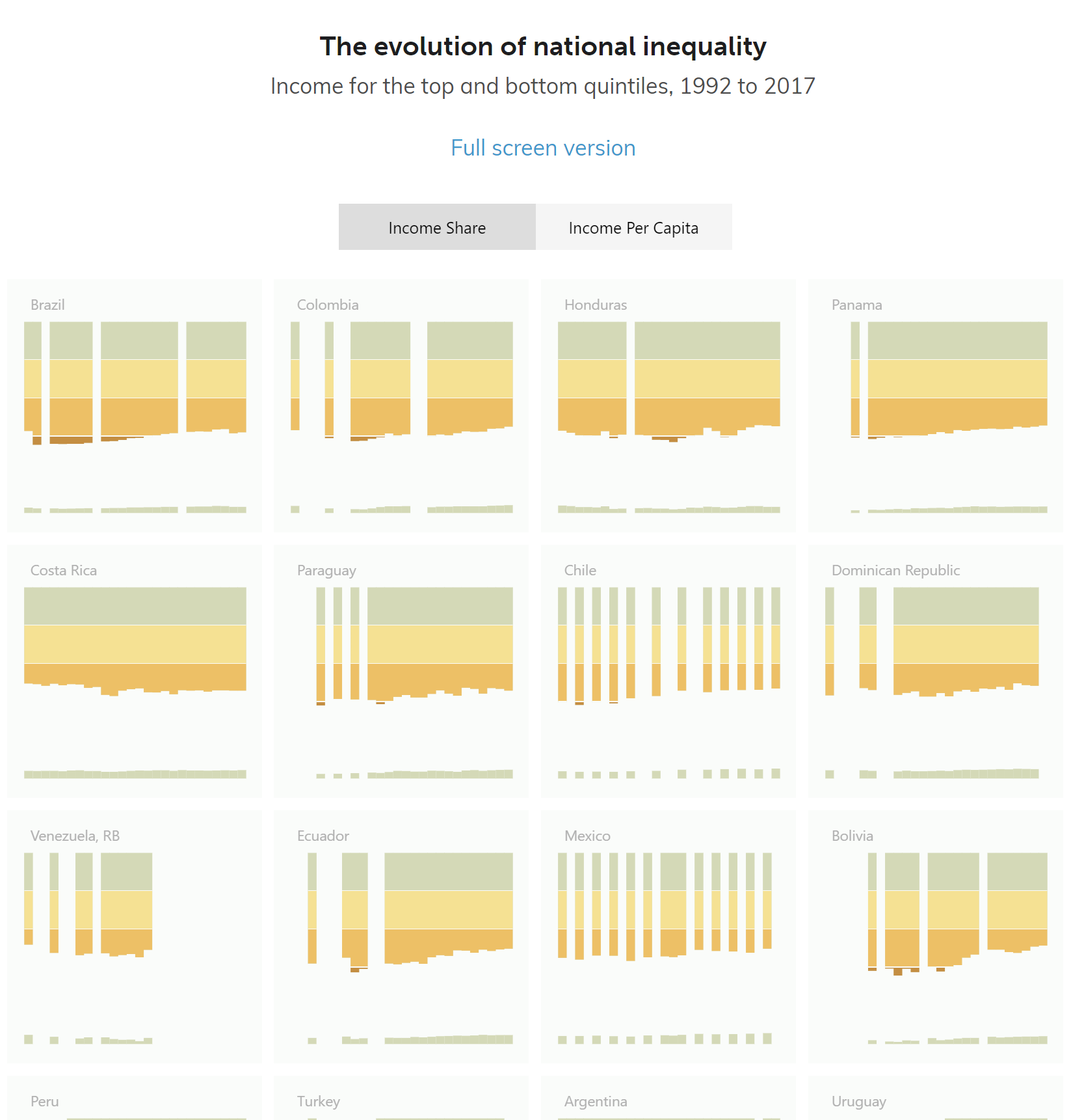
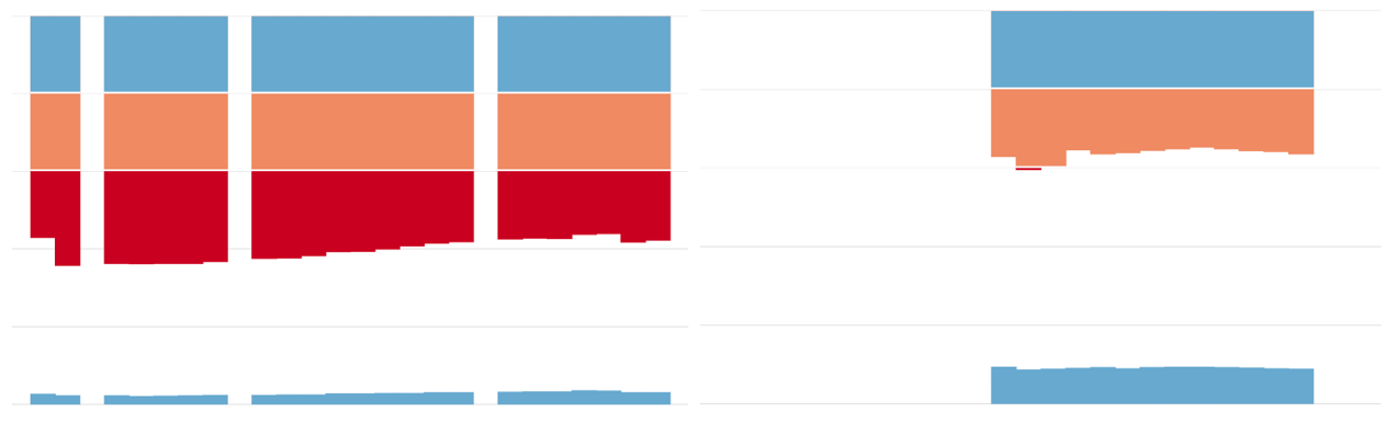
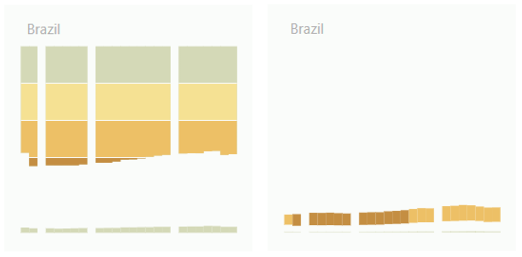
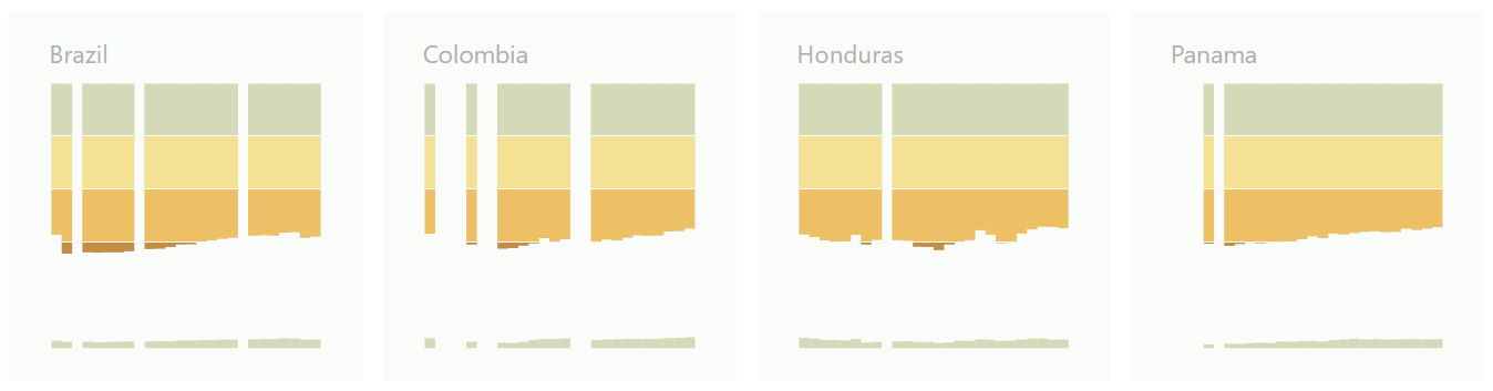
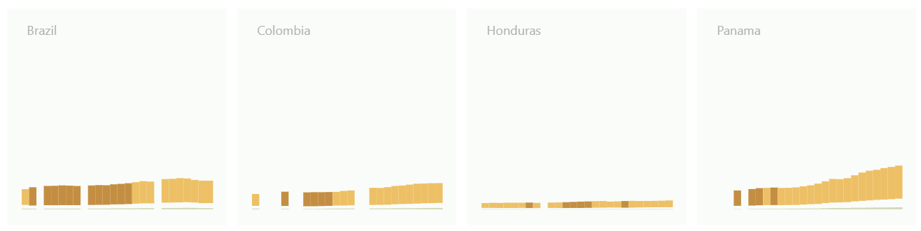
The “feature complete” iteration of the visualization below has a colour change every 20%. The chart layout no longer includes gridlines as they are essentially built into the visualization. Additionally, the charts have grey country names as well as a light grey background to group the title with the chart as well to define the chart area since there are no visible axes.
Colors
We ended up developing our own color palette with Adobe Color. Color Brewer is an excellent technical tool to choose colours with high contrast and legibility. In the case of this project however, such characteristics were not so necessary and we meant to have a more original look with a stronger accent on aesthetics. We were still trying to convey a certain progression from acceptable to bad. We chose the palette on the left.
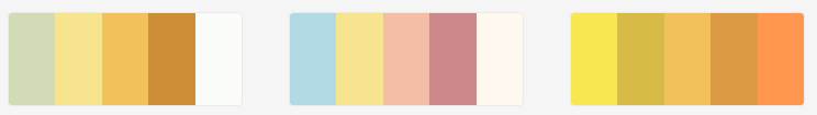
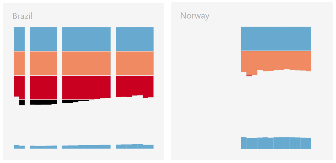
The visualization of income per capita uses the same colours but differently. We colour the bars in the annual income version (below right) the same colour as the bottom of the top 20%’s bar in the distribution visualization (below left). Conveying information about the income concentration in the annual income charts creates a visual and logical link between the two styles of charts.
Organization and layout
The countries are ordered from most unequal to least unequal according to the most recent data available. The size of the charts is kept small enough to allow for comparing several countries without having to scroll, yet large enough to remain legible.
Below is an excerpt from the final visualization.
Share of income
Income per capita
In a way, the process is more valuable than the final version of the graph because we used this project to experiment a little and to learn about our own processes, our tools and ourselves. Still, we are happy that we have something to show for it.
Erica designs and develops visualisations and proposes improvements for existing ones. She also researches and writes about information design, along with helping to organize activities and formalize processes at Voilà.