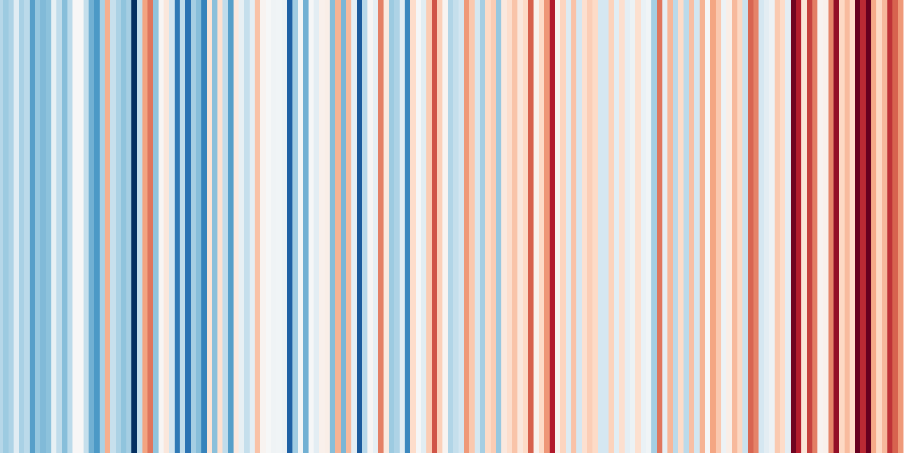
Chances are that you’ve come across this image somewhere:
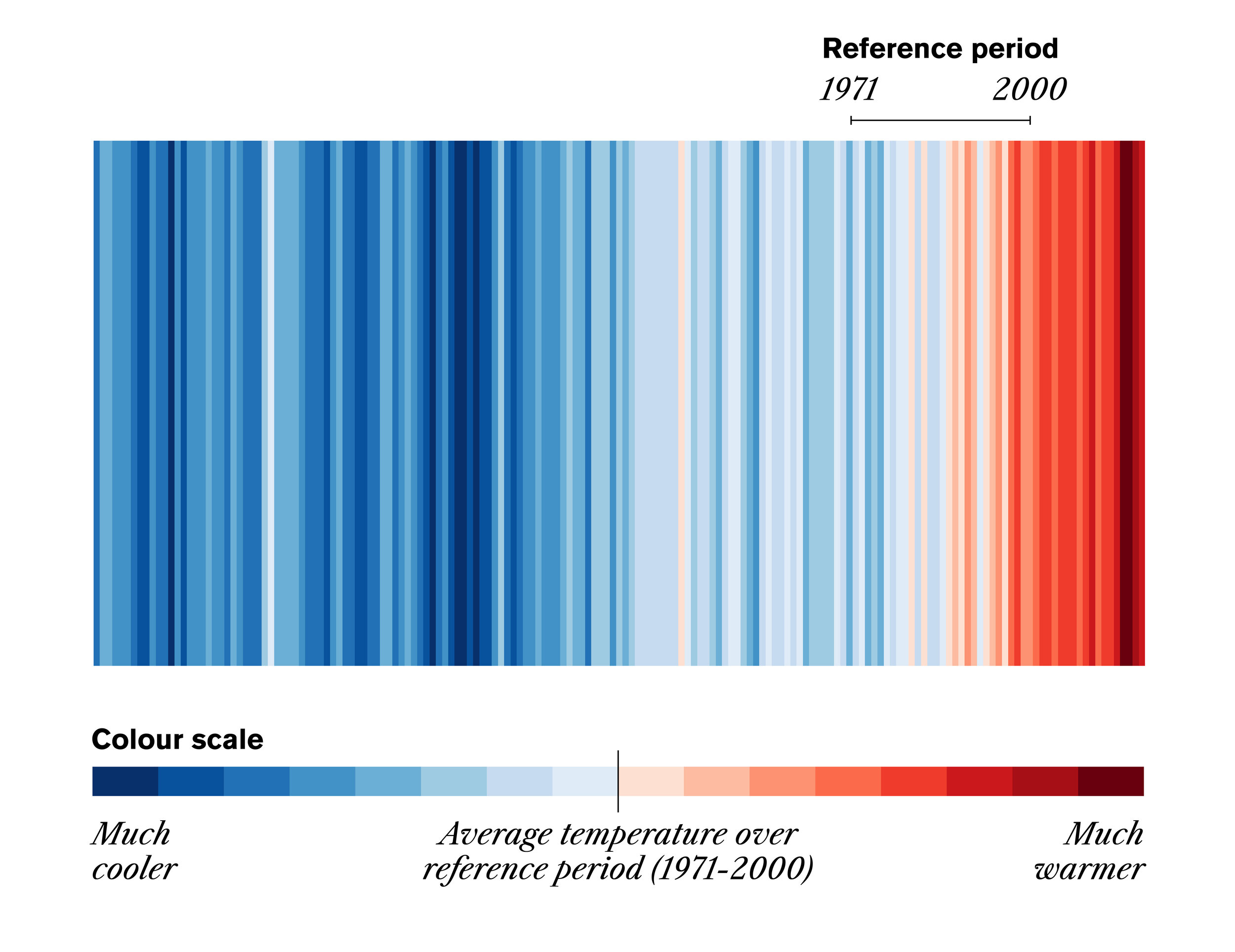
 Warming stripes for the globe from 1850-2018
You may have seen this elegant visualisation of rising global temperatures on social media, on the cover of magazines and newspapers, on protest signs, and even on ties, dresses and cars. Warming stripes (or climate stripes) were created at the University of Reading by Ellie Highwood, climate scientist, and Ed Hawkins, a climate scientist and professor who works to improve regional climate projections and quantify uncertainty in climate predictions and impacts. Their work came after what appears to be the very first use of this technique in 2015 by estuary scientist, Joan Sheldon.
The warming stripes were published on Hawkin’s blog in 2018, but they really rose in international popularity over the summer in 2019. Many have enthusiastically answered the call to #ShowYourStripes!
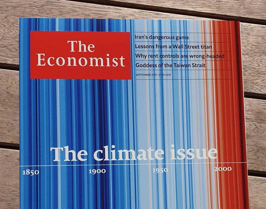
A cover of The Economist from September 2019

A dress worn by Dr. Heather Price
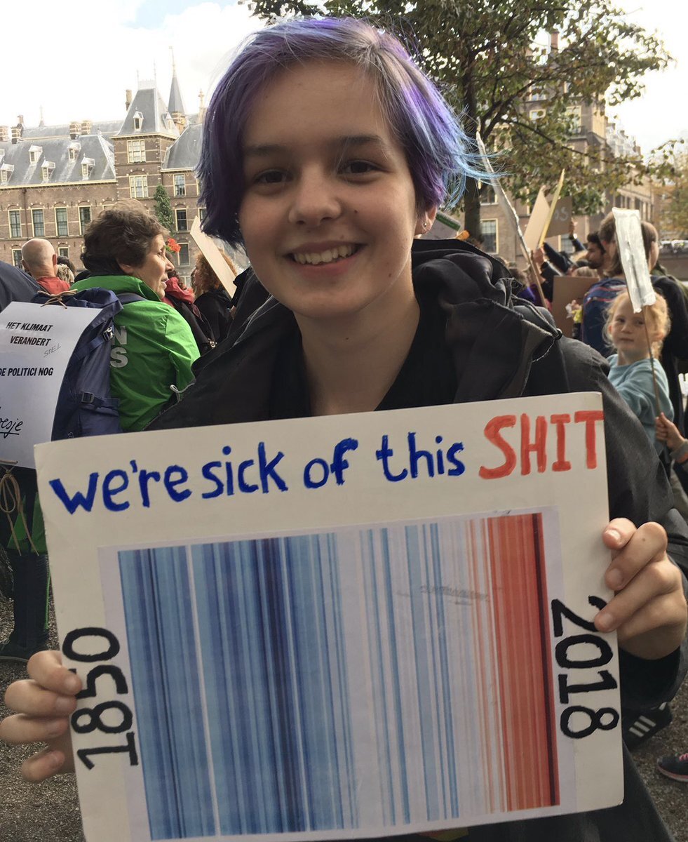
A protest sign by R⎊zijn

Mark Hanson ’s Tesla Model 3
Warming stripes seem to be well on their way to becoming a globally recognizable climate change symbol and like any effective representation, there’s more to this visualisation than meets the eye.
Why only coloured stripes?
The stripes are a minimalistic design, to say the least. On the Data Stories podcast, Ed Hawkins said that his goal was to create a representation that was as simple as possible to communicate trends of changing temperatures. He also wanted it to be intuitive for people who are not used to looking at graphs so the visual could encourage discussion without the viewer needing scientific or graphical literacy.
The result is a striking series of coloured stripes, varying from a deep blue to a dark red.
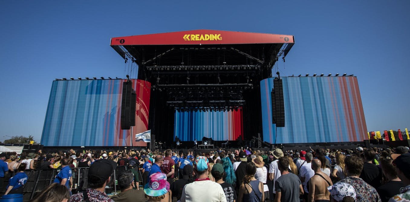 A background during Enter Shikari’s set at Reading music festival
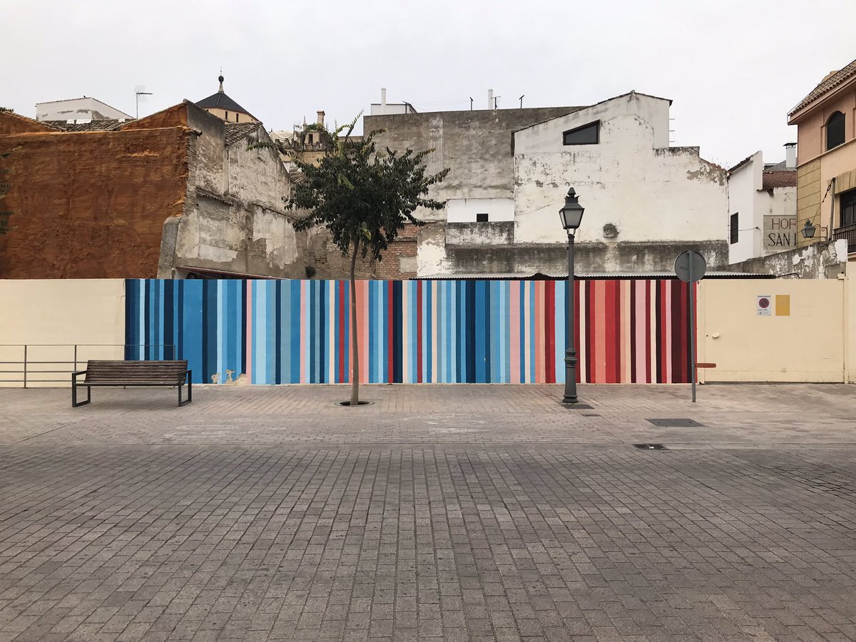
Wall in Córdoba, Spain
Information designers will notice what is “missing”: no title, no axes, no legend to explain what the colours mean. And yet, we intuitively get this gut feeling of a trend towards a world that is dangerously warmer.
What do the stripes show?
The graphics show the change in temperature over the course of more than a century. Each bar represents one year and is coloured based on the difference between the average temperature for that year and the average temperature during 1971-2000. Lower than that average, the bar turns blue. Higher, it turns red.
The darkest blue and the darkest red represent the temperature extremes for a given area during the time period shown in the chart — not necessarily high or low temperatures. Below, we added a white line over the stripes to show the same temperature variation, making it clearer that the stripes show when the extremes happen, not if the difference between them is small or large.
The difference in value between Canada’s extremes (dark blue, dark red) is much greater than the difference between Chile’s. Yet, the darkest hues are the same.
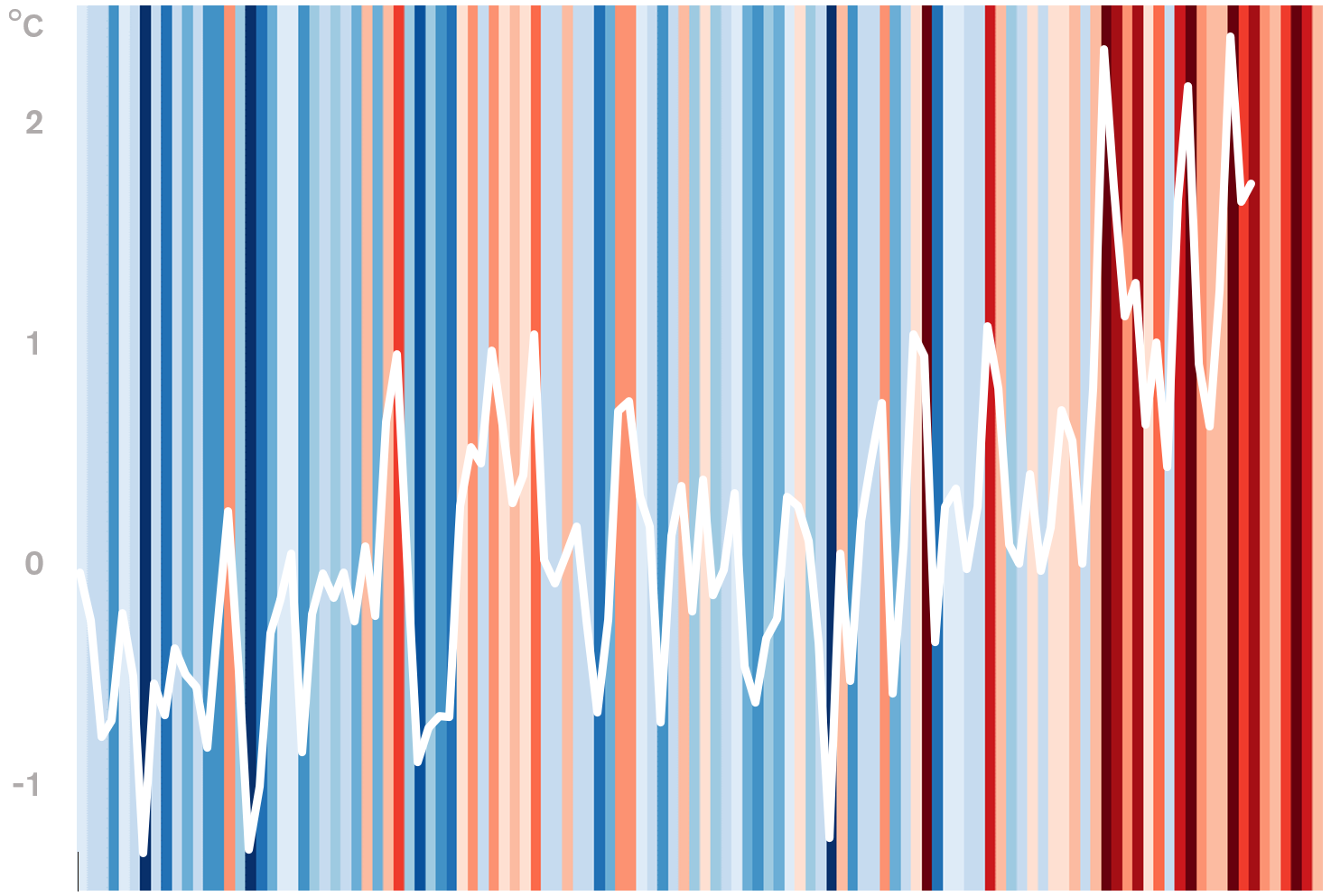
Canada’s stripes with temperature variation ( data )
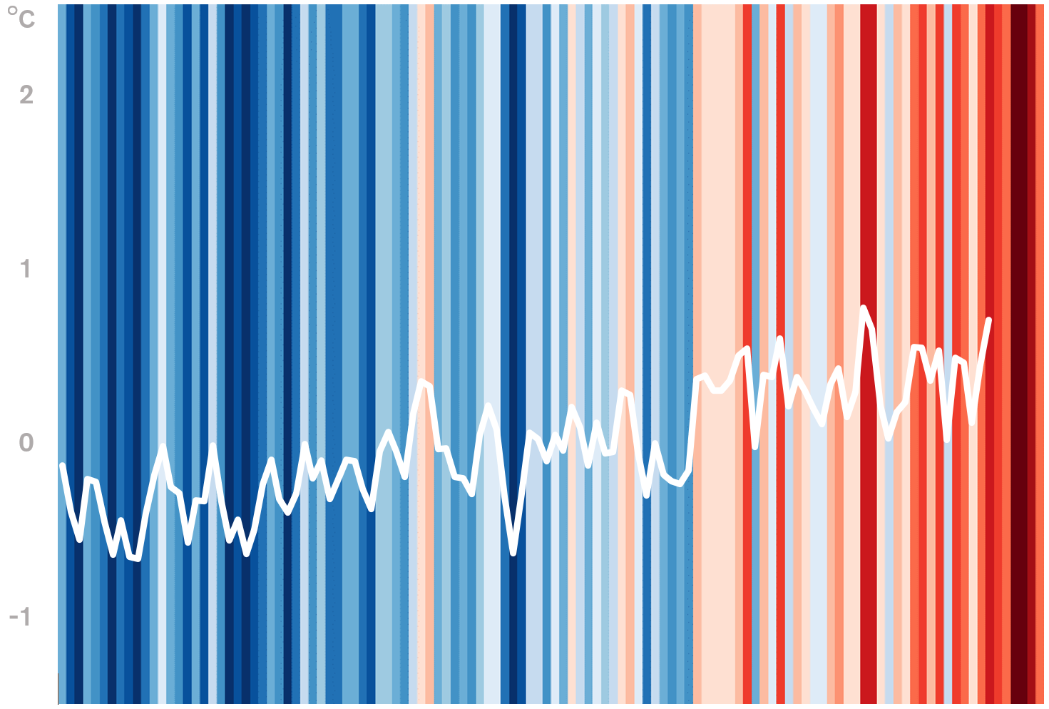
Chile’s stripes with temperature variation ( data )
Where do these colours come from exactly?
The source of the colours is the well-known ColorBrewer, a tool to develop optimal colour palettes for maps. As Hawkins mentioned via email, these palettes are designed to “represent data accurately and clearly”. The exact colours used are the 8 most saturated blues and reds from the ColorBrewer 9-class single hue palettes.
The elegance of the hues is probably another reason for the popularity of the stripes. In an email exchange with Voilà, Ed Hawkins said that the “choice of colours was an aesthetic decision — I think they look just right.”
Even the calculations were made with the visual result in mind. Hawkins wrote that he chose 1971-2000 as the reference because “this period roughly represents the mid-point in the warming so far”, that is to say the increase in average global temperature between 1850 and 2018. He added that this “ensures equally dark shades of blue and red appear”, which helps the chart feel aesthetically balanced.
The colours represent different temperatures in each graphic because the colour scale is based on the local reference average and the variability of the local data. So, the graphics show the trend for a specific area, but are not designed for comparing rates of change or specific temperatures between graphics.

Canada
Montreal
Why do the stripes work?
As Ed Hawkins hoped, the message that the stripes communicate is clear and visceral: Our planet is getting warmer and the situation is urgent. It’s possible to understand this message without any explanation. Why is that?
First, the stripes rely on established conventions. For the colours, we already associate blue with cooler temperatures (ice) and red with warmer temperatures (fire), so there’s no need to explain. As for time, it is represented like on most graphs: progressing from left to right.
Also, the upward trend in global temperatures is what people are expecting to see these days. Would this graph have worked 25 years ago when climate change was not as discussed by the public? Maybe not. Once more, data influences design choices: the trend in the data is what ultimately makes it possible to intuitively understand the warming stripes.
Putting the audience before the rules
One of the reasons visualisation experts are sometimes surprised by the popularity of Ed Hawkins’ graphics is that they break widely accepted visualisation design conventions. When asked by the Data Stories podcast about whether he had intentionally broken the rules, Hawkins responded, “I guess I didn’t know the rules. Maybe that helps.” He went on to emphasize that he believes we need different kinds of visuals to speak to different groups of people. This prioritization of the audience over the rules makes warming stripes an engaging and visually impressive example of how to communicate with the general public.
The visualisation tells you exactly what it wants you to think and feel. It takes a stance, but it’s not misleading in terms of urgency or severity. No need to read a more detailed graph or to assess the gravity of the situation based on the numbers. This is a graph that relies on the trust and prior knowledge of its audience because it doesn’t leave room to explore or interpret the data differently. The message is clear and you can either take it or leave it.
Is it art?
Their design is so simple and minimal that the warming stripes can be seen as data art.
Perhaps this is what makes them so powerful. They have become a simple identifiable symbol for complex ideas and a common front under which people can unite.
For now at least, warming stripes have replaced the polar bear on a melting iceberg as the icon of the climate crisis.
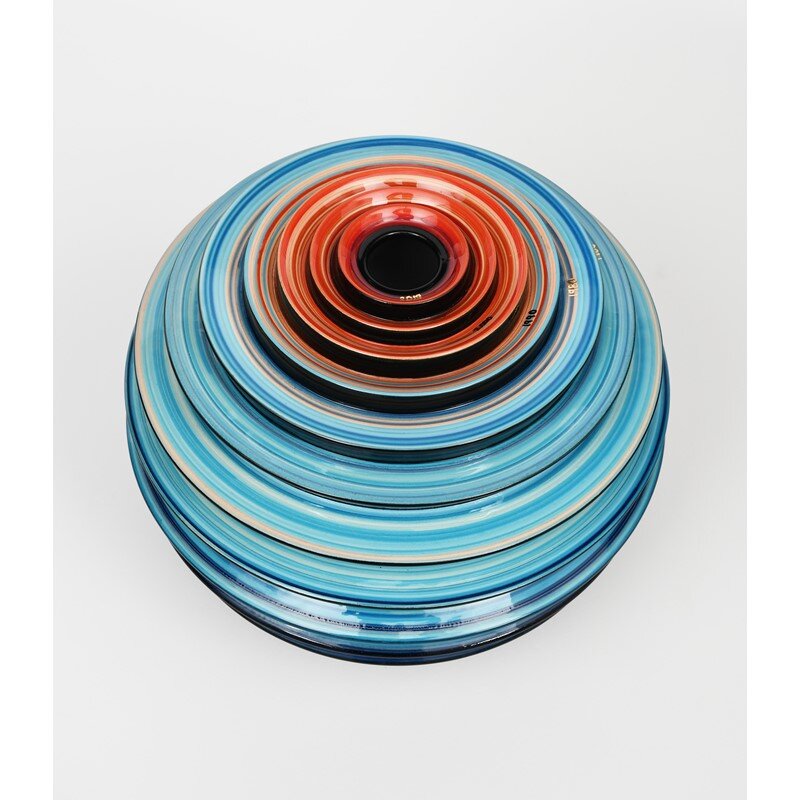
Vase inspired by warming stripes
Written by Erica Bugden and Francis Gagnon.
June 21, 2022: This post was updated to reflect the full history of the creation of the stripes.
Erica designs and develops visualisations and proposes improvements for existing ones. She also researches and writes about information design, along with helping to organize activities and formalize processes at Voilà.