
Imagine a forest: trees of varying sizes and types, leaves of infinite shades of green to red, trunks from brown to grey, rays of light, terrain variations, uneven ground coverage, the sound of the wind and insects, perhaps the movement of an animal in the distance. Now think of a spreadsheet of numbers and words, cleanly aligned in rows and columns.
How come the more complex scene is more pleasant?
The foremost debate of Visualized 2014 was about storytelling, likely because no one defined the term. Once Kim Rees said “I hate storytelling”, the trial began onstage and in the corridors. Yet, it seemed like the true theme of the conference, the one to which every speaker was bringing a perspective, was the same: How to make complexity comfortable?
One way, of course, is storytelling. Perhaps because they are documented, tragic, and memorable, sad stories were prevalent. Neil Halloran presented a detailed body count of World War II that was powerful and, for that very reason, nauseating. The presentation of drone strikes in Pakistan was equally troubling when recounted with images and videos by Wes Grubbs. The refugee project of Hyperakt and Ekene Ijeoma was no uplifter. Missing from all these representations were the causes of such tragedies, perhaps because no satisfying explanation exists. As the data becomes clearer, the reality becomes harder to understand.
Nature is another complex system with which we are comfortable to the point of finding it relaxing. Jonathan Corum used it to represent the exoplanets discovered by the Kepler spacecraft as planets circling their sun, almost as they do in reality. The image is familiar, even if humans do not witness planetary orbits directly, only their effect. The designer relied on this familiarity to avoid encoding aspects of the phenomenon that could be shown in a way that mimics nature. The work of NASA presented by Jeff Norris similarly attempts to give humans a more natural experience of far away places using immersive systems. The results are vastly superior to abstract methods of spatial orientation, perhaps not surprisingly. The human face, this ubiquitous yet complex natural way of communicating, is the key to Selfiecity, the project presented by Lev Manovich and Moritz Stefaner. Good maps also fall in this category.
Then, there is art, a complex but successful human construct. Figurative, it recreates the complexity of our environment. Abstract, it becomes uncomfortable to some when simple and highly valued, as if it were not natural to enjoy simplicity. Onformative turned a set of fine watches into abstract, circular wireframes, based on arbitrary characteristics of the watches. The client was likely interested in a slightly aloof piece that flatters the viewer’s ego by suggesting that he or she is one of the few sophisticated enough to get it, a crucial argument of the luxury business. The result is pleasant and attractive, even if detached from meaningful data, let alone an understandable encoding of it. The pictures found in many of the projects, and a building block of the biodiversity project visualized by FFunction, draw from the art of photography to add a layer of complexity, yet make the data more accessible.
The work of Giorgia Lupi at Accurat has an artistic quality that attracts the eye like a painting. Her visualizations are more like figurative paintings, aiming to convey a reality found in the data. Yet, what art giveth, art sometimes taketh away. One participant mentioned that none of his students could find an insight on the lives of painters after spending ten minutes with the piece. They had spent their time understanding the encoding.
This tension between aesthetics and analysis can be resolved, as some outstanding visualizations have done. The cyclogram of a Russian spaceflight, the timeline of Picasso’s painting, a French train schedule from the 19th century, all combine artistic attractiveness with analytical power.
Storytelling, nature and art rely on instincts that predate the age of data. A most compelling toolbox to make complexity comfortable.
Postscript: A Personal Note
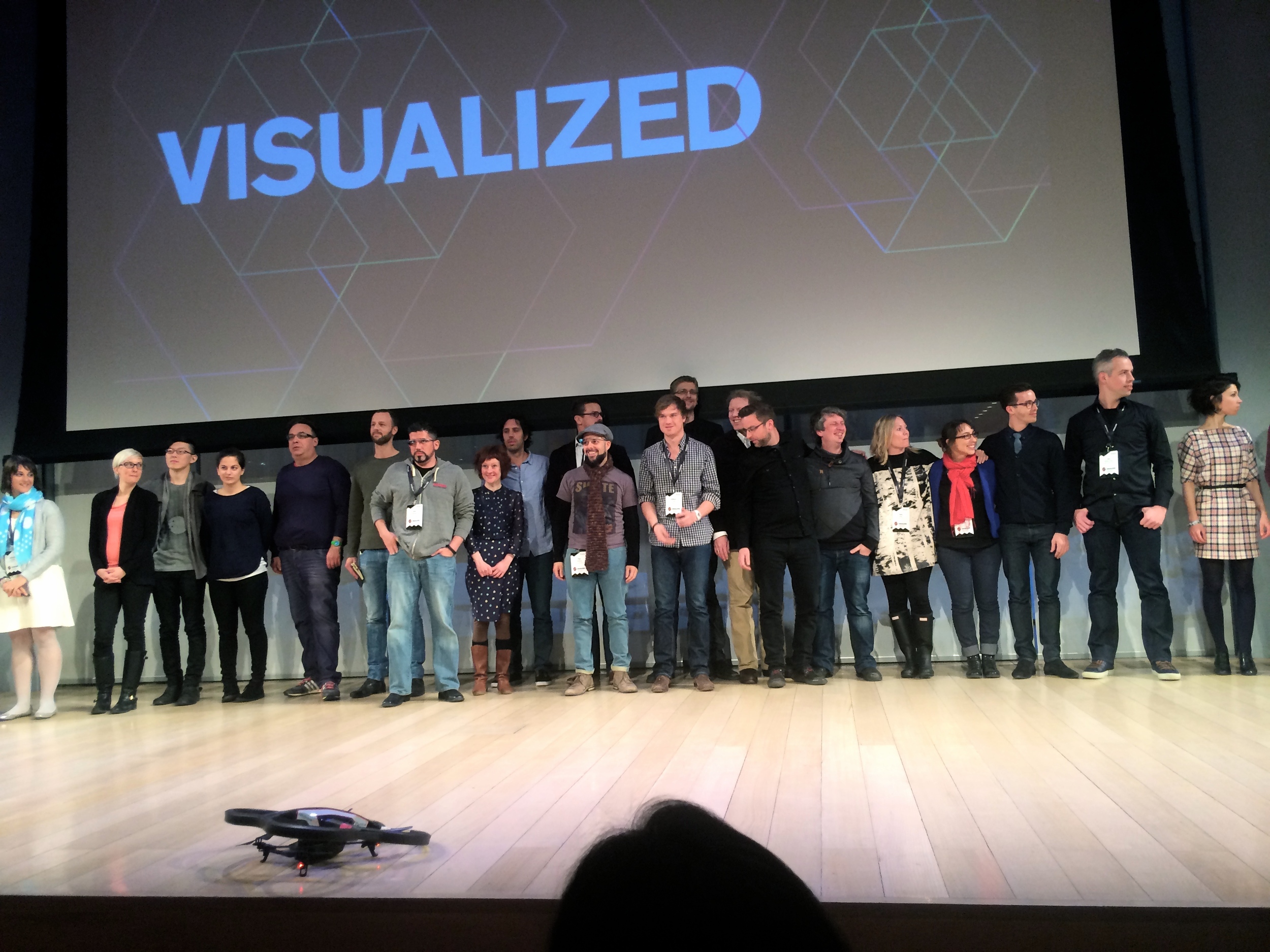
My first participation to one of its conferences confirmed that the data visualization community is welcoming, young, dynamic, unproven but benefitting from its multidisciplinarity and lack of structure. Special thanks to Jon Schwabish and Lynn Cherny for taking me around and patiently introducing me. A man of my age shouldn’t appear star-struck, but it was all I could do not to ask autographs from Kim Rees, Jonathan Corum, Amanda Cox, Jer Thorpe, Giorgia Lupi, Wes Grubbs, Jan Willem Tulp, Santiago Ortiz, Moritz Stefaner and countless others. Some of them will recognize our conversations or their tweets in the reflexions above. I’m very grateful and look forward to seeing you again.
Update (Feb 10): See my 16 pictures from the event.

