What does banking look like, in one image? How about evaluation? And training?
That was the easy part. Now, what about the need to improve? Or to speed up and simplify a process? And finally, innovative financing models?
Designing information requires to think of visuals for concepts that may or may not have a strong image associated with them. These icons will come up in brochures, infographics, presentations and websites. Being able to find just the right image that will anchor the concept in the reader’s mind is probably more art than science, so I’m sharing my own thought process here with examples from a recent product.
The Independent Evaluation Office of the Global Environment Facility has recently completed a massive evaluation — in fact, tens of evaluations — that are crucial to the future of the GEF. The reports have been published and the IEO wanted to get the word out so they approached us to develop an infographic (pdf) that would present their 10 conclusions, as a teaser inviting their audience to have a look at the full report.
 Click to see the full PDF.
1. Use simple shapes
The fundamental principle of design “keep it simple” applies here. An icon does not have to be complicated and in fact, it should not be. Very simple, common shapes can often do wonder in context, as the eye recognize the reality that they represent, as if guided by gestaltism.
Almost all of my icons are made of simple, often geometric shapes drawn in Adobe InDesign or Microsoft PowerPoint.
In this example, it’s nothing but lines and a circle. The key idea is that the GEF has been a catalyst for the agencies that they fund to develop better safeguards. By establishing this new criteria, the GEF has started a reaction across the agencies, much like the domino effect illustrated. No need to draw actual dominoes with their dot patterns, nor to draw a sphere with complex shadows. It will not convey the idea any more efficiently.

Here, three concepts — scaling up, replication and market transformation — are different but have in common the idea of massive growth found in the conclusion. It is sufficient to use the arrows and hint at a line chart with a logarithmic growth, without resorting to all the elements of a chart or perhaps finding what is the true growth pattern of the three concepts.

2. Leave out entire ideas
It’s common to have to illustrate a complex idea with several propositions. It might be tempting to find a visual hint for each of them, but that would require your reader to decode all those signs, in a way that is much less efficient than reading the sentence.
One idea is generally sufficient: it’s an icon, not a rebus. It may not show everything, but it’s enough as an entry point or a memory marker.
The IEO had found a lot of useful knowledge generated and captured by the GEF on its project, but also that it was not always accessible. Simply illustrating the latter idea with a vault is sufficient. No need to illustrate the concept of knowledge at the same time. Having, say, a book in the vault would only force the reader to decipher two abstract concepts and their relationship. It’s too much responsibility for a single icon.

In this example, we have taken out all substance to illustrate solely the generic concept of “size matters”. In fact, we even evacuated one of the two ideas in the conclusion (in-house expertise). The ladder is too short for the wall, a metaphor for the GEF financing that needs to be sufficient to overcome the market barriers that it addresses.

3. Find the essence of an idea
A visual is meant to reveal the essence of a concept. This may be one of the most difficult aspect of drawing an icon because it requires a true understanding of the content and message. It’s worth it though because relying simply on the words used in the concept may miss the point entirely. Also, finding how to visualize the essence is often the most satisfying moment of icon design.
In this example, the conclusion was a number, which might be tempting to illustrate with a graph, even a pie chart as a single percentage carries over well to such a graph. But the key idea is that the gender analysis seems to be found seldom and at random in the documentation of new projects. The GEF does not appear to have been as systematic as it should at this stage of the project development. So the visual takes this idea to illustrate task completion with a checkmark, while the missing tasks receded with an X on a light green background. This way, success looks haphazard, and not like a process that was suspended, as it would if we had put the seven checkmarks together at the beginning.

This following example is counterintuitive: the idea is limited guidance, yet the icon is a road sign that provides guidance. First, the goal of the icon is to anchor the idea of guidance simply, which the sign does nicely. Also, the road sign is ambiguous: it’s a fork in the road without any indication of what direction the traveler should take, which brings us back to the idea of limited guidance.

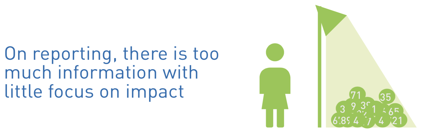
This is one of the more complex icons in this infographic, but it’s also one of my favourites because the concept was so difficult to capture. The IEO found that the GEF captures a lot of information, but not always about what matters most: impact. The GEF can dazzle with numbers about timelines, outputs and the likes, but what about the people they were trying to help? It’s this idea that is shown here, with a spotlight on a heap of numbers, next to a person that is out of the spotlight. Alternatively, if the reader only sees someone lighting a heap of numbers and misses the misdirection, it still works.
4. Use abstraction
Icons often illustrate a physical reality, like people, trees and houses. But there is a great wealth of information in abstract shapes. When well-designed, an abstract shape can be as evocative.
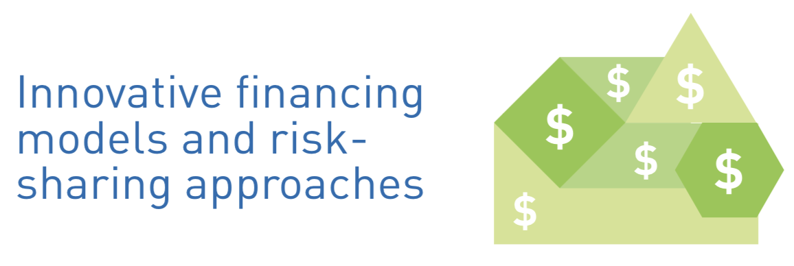
Below, the concept was already abstract. Financing models are not just money, they are the structure of a financial transaction. How much interest will the borrower pay? When will the repayment be due? What sort of collateral is accepted? The idea is that the GEF had gone the extra mile to find new ways of lending or granting funds to prompt behaviours that would achieve its environmental objectives. They had been flexible, they had adapted to the circumstances. From this came the idea that their money comes in all shapes and forms. The GEF will make it fit to the particular circumstances of a project. The visual reflects this by placing dollar signs in a combination of odd shapes that fit together.
In the following case, the challenge was that we had already illustrated the concept of scaling up (see upward arrows above), so a new icon was required. After all, we are trying to make the infographic visually engaging. The circles illustrate the idea of progressive growth. By using eccentric circles, we avoid the image of a target that could have formed in the mind of a reader with concentric circles.

5. Data illustration is ok
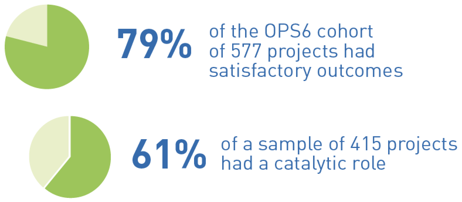
Sometimes, it’s a number that you need to illustrate. It may be a single number or a small collection. I have read somewhere (Stephen Few perhaps? Or Edward Tufte?) that a pie chart is more data illustration than visualisation, given its simplicity and paucity of information. It’s also a very clean graph to show a single percentage because the eye can identify each of the quarters. In the case below, it’s immediately clear that the first percentage is a little over three quarters.
Icons are not the end all of an infographic. Copy, hierarchy, structure and data visualization are equally and sometimes more important. But the icons serve two main purposes: to lighten the look of a text-heavy document and to anchor an idea. Do not rely on icons to do the work of your text, but use them to attract the eye of the reader and maybe to linger in their minds.
Contact Voilà if you need icons for your infographics and presentations.
Francis Gagnon is an information designer and the founder of Voilà: (2013), a data visualization agency specialized in sustainable development.