It doesn’t matter if you kick a ball, ride a horse, dance with skates or race down a hill: all sports tell the same stories. The underdog. The comeback. The dynasty. The near-miss. The feuds. The rivalry. To get interested in any sport, get to know its stories.
One such story is the young prodigy. A new competitor, often young, who comes with tremendous talent. In Formula 1 racing, it is the recent story of Max Verstappen. The son of a former Formula 1 driver (a whole other story), he was the youngest F1 driver in history, at seventeen and a half years old. I pass the mic to Wikipedia:
“He is also the youngest driver to lead a lap during a Formula One Grand Prix, youngest driver to set the fastest lap during a Formula One Grand Prix, youngest driver to score points, youngest driver to secure a podium and youngest Formula One Grand Prix winner in history.”
He’s generating a lot of excitement, needless to say. His aggressive style of driving is responsible both for his successes and failures and it will be interesting to see if he manages to adjust.
At the most prestigious grand prix of the season, in Monaco, he made one such mistake and crashed his car during qualifications, meaning that he had to start from the back of the grid. This is very bad news in Monaco where passing is notoriously difficult because it takes place in the middle of a city.
This is what makes the performance of Max Verstappen so interesting. He started in 20th position and ended in 9th, meaning that he scored points towards championship, which is very important for a team and a career.
The official graph of the race prepared by the Fédération internationale de l’automobile, overseeing F1, does not really show this, even if it shows all the data (as with many bad graphs). Verstappen is the electric blue line, but its progression gets lost in the traffic.

It seemed like removing some information irrelevant to the story at hand would help to make it more visible. For instance, we are here interested in a single driver. Also, we are only comparing the start and finish positions. It seemed like a slopegraph would do the job just well, as it conveys the idea of ranking clearly, on a vertical axis. I used the colours of Verstappen’s racing team, Red Bull, because they are bright and attractive and that this graph is about him.
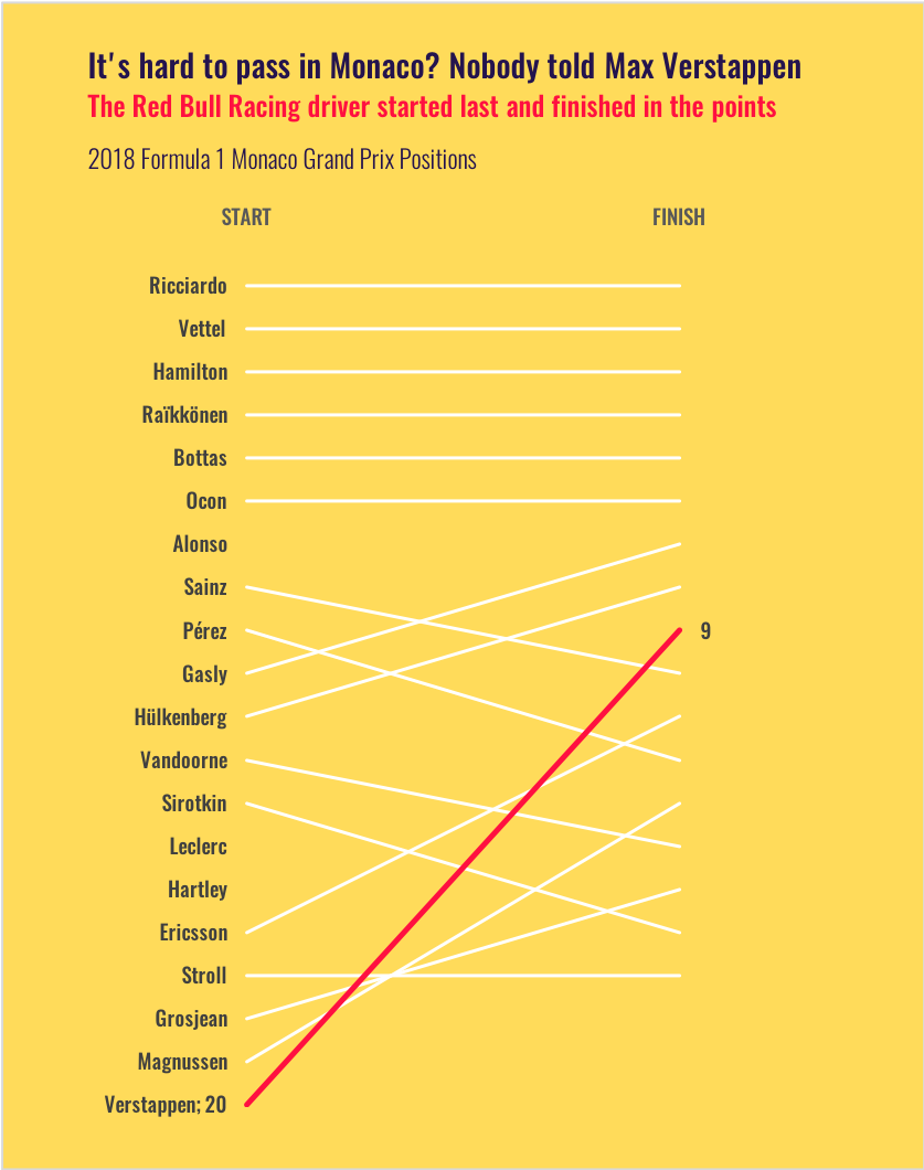
I worked quite a bit on the title because it was going to give the spin to the graph, to reveal what’s interesting about it. The result is a title that both conveys the scale of the challenge and the boldness of Verstappen. Then my subtitle is more descriptive, getting at the point.
I did not write the positions of any other driver. The line for Verstappen is very contrasting, in dynamic red. It passes over several lines and its angle is steeper than any other line. It conveys a very simple message: he started in the back and made it unusually high in the ranks. Also, the horizontal lines of the top 6 racing drivers suggest that it’s a race where the starting order tends to determine the finishing order.
It turned out that Cole Nussbaumer chose slopegraphs for her #swdchallenge a few days later, so that’s my submission.
Francis Gagnon is an information designer and the founder of Voilà: (2013), a data visualization agency specialized in sustainable development.