Data visualisation is a language for humans. Computers and machines are fine with raw data. On the other hand, humans are often interested in data simply because it is visualized. Many will understand the underlying phenomenon — a trend, an outlier, a missed target — when they see it in a graph.
Humans speak data visualization from birth and through learning. There are right and wrong ways of doing it. When trying to communicate, it’s as important to know what works and what doesn’t, just as it is with any other language.
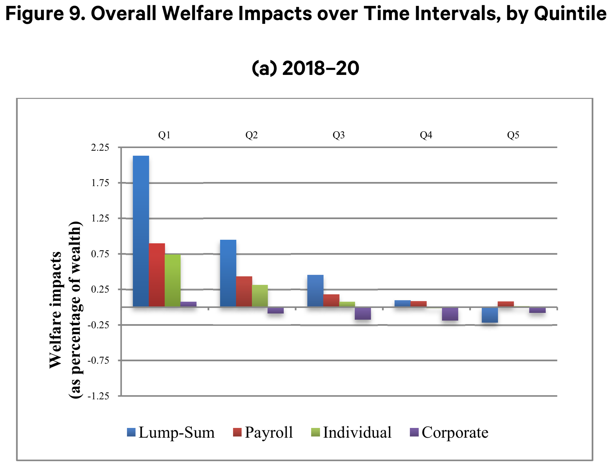
Which brings me to this chart, included in a report from Resources from the Future, an independent, nonprofit research institution in Washington, DC.
 Page 53
I became aware of it when this tweet appeared in my timeline. It’s not from the report author, but from another climate specialist that marvels at the finding he sees in the graph.
This figure showing the impacts of a carbon tax across the income distribution from this new @RFF_org working paper kinda blew my mind. Here’s a thread that tries to explain why: https://t.co/0fbT7cUOdg pic.twitter.com/ao4wnJmfaD
— Noah Kaufman (@noahqk) October 25, 2018
One look at the graph and I knew it would be hard to decipher. Also, it looks like it was done quickly as it’s just a quick Excel graph with all the default features. This upset me because it seemed an important piece of information and this issue is very close to my heart.
The lazy data visualization in such a serious and important paper drives me nuts. YOUR DATAVIZ DESERVES TO BE GOOD! https://t.co/8cVKOzKkAS
— Francis Gagnon | Voilà 📊 (@chezVoila) October 25, 2018
Here is what’s wrong with this graph, in no particular order.
Appearance
The look of the graph is the first thing that made me realize something was not quite right. It uses the Excel defaults, with some drop shadows. It tells me that little care has been put into preparing this graph for publication. When reaching out to an external audience with the goal of attracting and retaining their attention, and to be taken seriously, aesthetics is not a luxury, it’s a step you can’t miss.
Labelling
It took me a while to realize that Q1-Q2-Q3-Q4-Q5 do not represent quarters. Our natural instinct is often to assume that the horizontal axis represents time, until proven otherwise. Here, Q1 means Quantile 1, but does Q1 means the top quintile or the bottom quintile? For people who do not study economics, it may not be obvious. This could be made clear by labeling the Q1 “Poorest” and Q5 “Richest”.

Title
Noah Kaufman had to translate the graph for his Twitter audience in part because the graph did not make clear what it was showing. The title is purely descriptive, something newspapers would never do since it’s their job to communicate clearly, even in their reporting sections.
Here it seems that the title should be something more analytical like “The poorest will benefit from any of the measures”, to follow Noah Kaufman’s analysis.
Annotations
What annotations? There are no annotations to help us understand what’s going on, no pointers at the relevant parts of the graph for instance. Annotations are especially important in graphs that do not make it clear where we should be looking for what.
Text orientation
Research suggests that it takes twice the time to read vertical text, over horizontal. But the real issue is that we simply don’t read vertical text. Our eyes glaze over these meaningless shapes in a way that they can’t when text is horizontal. The vertical axis has a vertical label and it has taken me several attempts and the resolve to understand this graph before I truly read and understood it.
Colors
Colors are not neutral. Green is associated with positive meaning, like money, growth, and ecology. Red’s connotations in Western culture are negative: blood, violence, losses (and love, yes). It should not be used randomly, but in the present case it simply identifies one of the approaches (“Payroll”) that is no better or worse than the other three. It creates a Stroop effet where we initially assume something before having to discard it.
Horizontal axis
One of the main features of this graph is to differentiate between positive and negative impacts. The baseline should be a strong visual feature so that the eye immediately sees where it’s crossed. In reality, it’s barely differentiated from the grid. The shadows obscure it further.
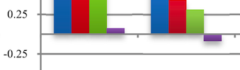
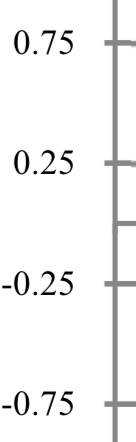
Vertical axis
The scale is inconsistent: it starts with a 0.25% interval and then moves to a 0.5% interval. It’s best to use consistent and intuitive increments. Another interpretation is that the scale has increments of 0.5% (-0.25 to 0.25% to 0.75% etc.) but that the zero baseline is completely ignored, which is not much better.
Redesign
Here is my suggested redesign, with the caveat that I did not speak with the authors, nor have I read the entire report in details. Also, I couldn’t find the data so I eyeballed it from the original graph.
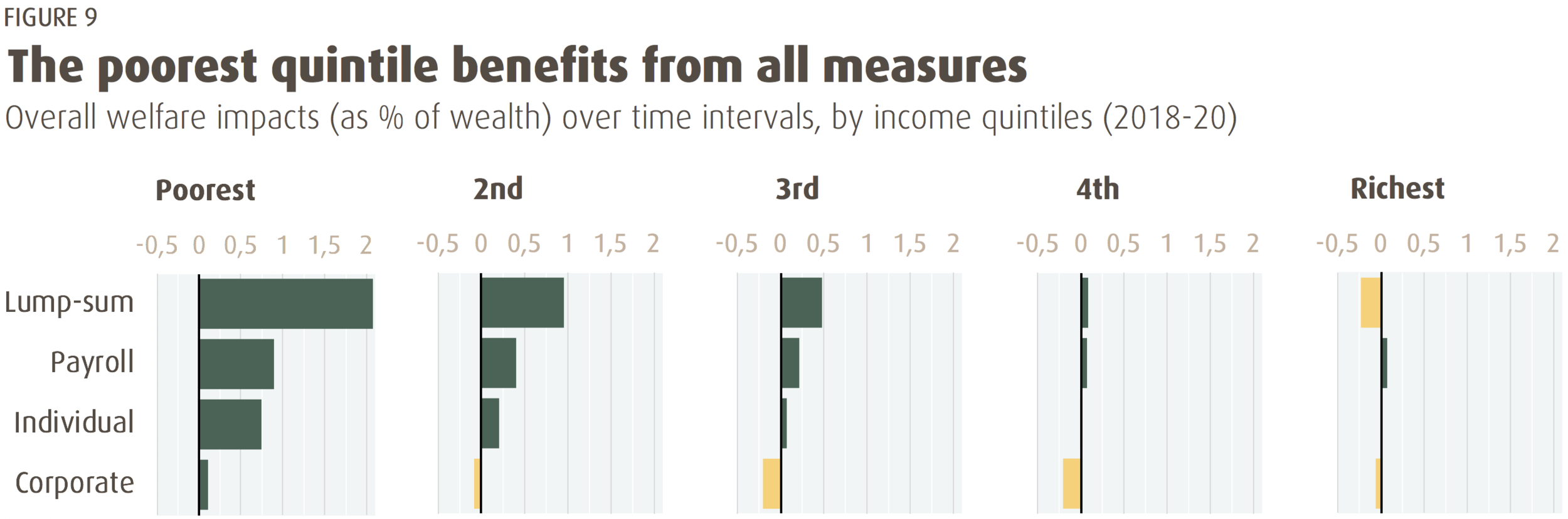
A few observations:
-
Font: Dax
-
Colors: Wes Anderson palette from a scene in Hotel Chevalier.
-
Green for positive values, yellow for negative ones help the eyes immediately identify this crucial distinction.
-
With a panel chart, I like to use a faint background for the graph areas to help the eye differentiate them.
-
There are no annotations because they don’t seem necessary now that the chart is clearer.
-
The horizontal axis does not carry the label because it is mentioned in the graph’s subtitle.
-
Using horizontal bar charts gives space for the labels, without having to repeat them, nor use different colors for the different measures.
-
I would have preferred to use a vertical layout, with the graph for the poorest quintile at the bottom, because that’s how we think of income groups (top 1%, bottom 50%, etc) but it put the most important graph at the bottom, so it was not worth it.
-
It was all created in Excel; no need for fancy tools.
Many countries are considering a carbon tax to address climate change. In fact, Canada is embarking on a major political debate about a carbon tax and its distributional impact. One year ahead of the election, the party in power appears willing to bet the house on a measure that might be good for the environment but politically controversial. This type of communication can make a difference in how the public understands what they are voting about.
The latest report from the IPCC makes it clear that the future and safety of millions is at risk because humanity is failing to take decisive action to address climate change. The work that RFF and the likes does is tremendously important and helpful. This issue deserves to be explained and promoted with the same care that we, silly humans, put in advertising cars.
Francis Gagnon is an information designer and the founder of Voilà: (2013), a data visualization agency specialized in sustainable development.