The current dataset
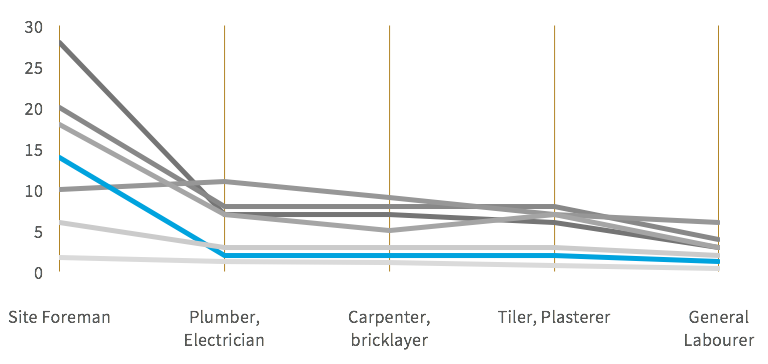
This graph is meant to show how wages in Nigeria compare to other countries across several professions related to the housing market. Each country is represented by a color, in default Excel fashion.
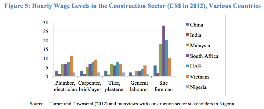
This graph shows all the data but it is difficult to read, let alone to see how any given country compares. At first, this seems like a good opportunity for small multiples, with either jobs or country groupings. But reading the text, it appears that the goal is to compare Nigeria against other countries for each profession, and not across professions.
“Labor costs in Nigeria are not high. At N2,500 or US$16 per day (US$2 per hour) for artisans and N1,500 or US$10 per day (US$1.25 per hour) for laborers, labor rates in Nigeria appear to be low in comparison with competitor countries (Figure 5). ”
The bar graph does not show clearly that costs in Nigeria are lower across professions than in most other markets. On a parallel coordinates graph though it becomes quite clear where Nigeria stands against other countries:
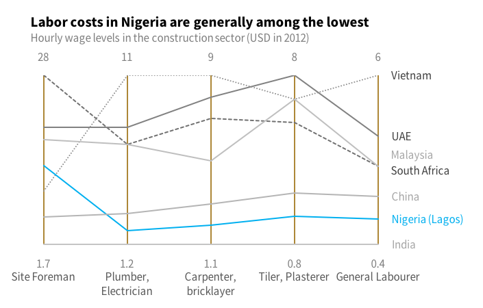
By highlighting Nigeria, the message becomes clearly visible. The reader is no longer invited to parse the entire data set to find something of relevance: the graph makes it clear and corresponds to the accompanying text. The other countries are in shades of gray, with minimal differentiation, because they are only relevant in their position relative to Nigeria.
If parallel coordinates can work so well, why do we see them so seldom? First, they have the counterintuitive feature that lines (series) do not represent a progression. The categories are nominal and can be reordered, changing the shape of each series. Also, I personally rarely come across a dataset that lends itself to a good parallel coordinates graphs. Finally, I’m not aware of a popular software with built-in capacities for such graphs. This is why we’ll have to trick MS Excel a little to create this one.
How to do it in Excel
Prepare the dataset
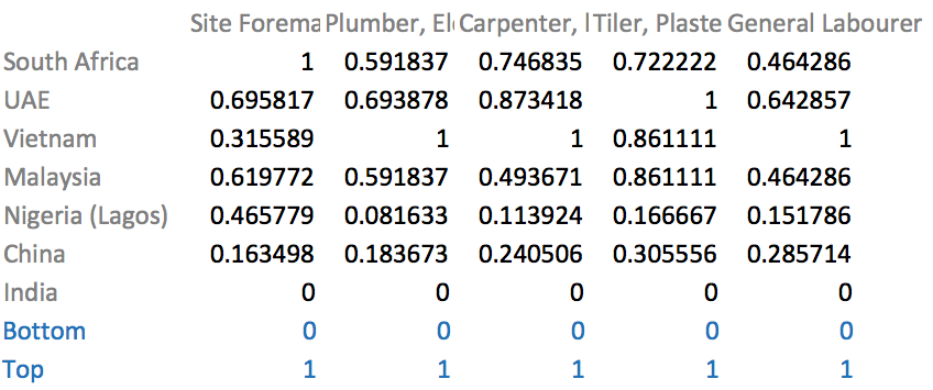
The first step is to prepare the dataset. The original one looks like this:
 Original dataset
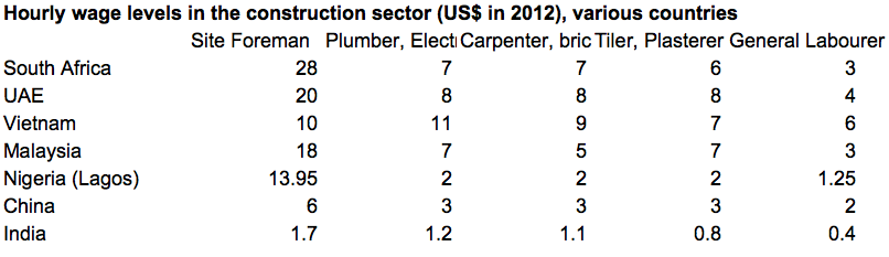
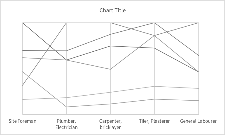
It is in the right structure and can be used to create the graph below. The ranges of the data vary somewhat, with professions reaching $28/hour while others top at $6/hour.
 Single vertical range
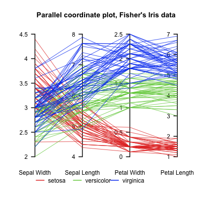
The range for the site foreman data distorts the rest of the data, compressing the data in a reduced portion of the vertical axis. Most importantly, parallel coordinates are not meant to compare amplitudes across categories, but position along a range for each category. In fact, parallel coordinates are often used to compare categories with different measures, such as in this example about cars.
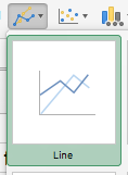
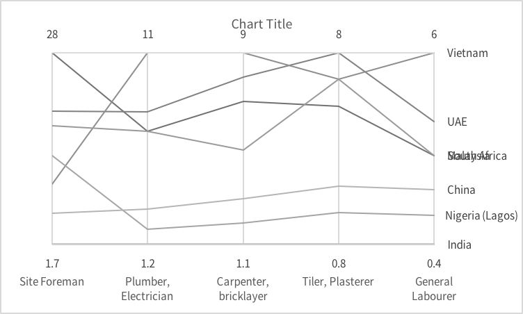
To make full use of this type of graph, we need to normalize the data so that each profession use the full range of the vertical axis. To do this, start by copying your entire dataset below the existing one. Then in the copy, change the value of the first data point with a formula to normalize. Here’s a short explanation of how to do it. Here’s what it looks like in my spreadsheet.

After you’ve applied the formula and copied it to the entire table, it will look like this:
 Table with normalized data.
Note how each category has a 1 value, representing the country with the highest value in each category (profession), and a 0 value, representing the country with the lowest value.
We’ll immediately add two rows to our data that will be used later for labelling purposes:
- Top: 1
- Bottom: 0
It looks like this:
Draw the graph
Technically, a parallel coordinates is a simple line graph. Select your entire dataset and create a line graph. It will look like this after you’ve switched rows and columns.
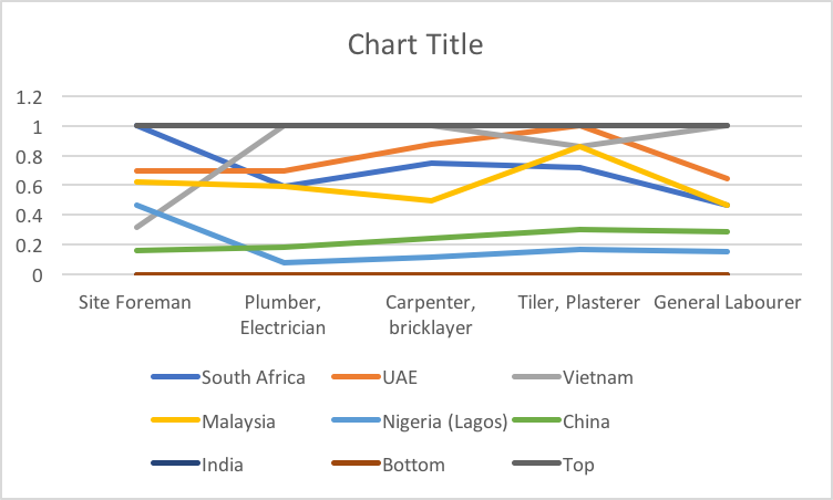
The basics are there, but it needs some love.
- Remove the horizontal gridlines.
- Add vertical gridlines, one per category.
- Make it so that the axis position is on tick marks (“Format Axis”)
- Change the color scheme to monochromatic gray.
- Reduce the size of the lines to 0.75 pts.
- Set the range of the vertical axis from 0 to 1, then make it disappear.
- Erase the legend.
- Make the plot area border and the horizontal axis line disappear.
- Choose your font. In my case, it’s Source Sans Pro 8.
By now, my graph looks like this.
Next step: labeling:
- Label the last point of each series with the series name (excluding “Top” and “Bottom” of course).
- Adjust the width of the plot area and graph to place the labels on the outside of the plot area.
- To label the top of the vertical axis, select the “Top” series and label it with its value.
- Manually change the value to the maximum value of each range (site foreman: 28, plumber: 11, etc.) by double-clicking on each number.
- To label the bottom of the vertical axis, select the “Bottom” series and label it with its value.
- Manually change the value to the minimum value of each range (site foreman: 1.7, plumber: 1.2, etc.) by double-clicking on each number.
- Distance your category label away from the axis (value: 600), so that the bottom labels no longer overlap.
My graph now looks like this:
Next step is colouring.
- Set the width of the “Top” and “Bottom” lines to 0 to make them disappear.
- Use 50% grey for your axis top and bottom values.
- Give a contrasting color to your vertical gridlines. The point is to make them stand out, as opposed to normal gridlines that act as mere reference points.
- If relevant, give a contrasting color to your main series.
- Adjust the shades and dashes of all series for clarity. Color your series labels accordingly.
It now looks like this:
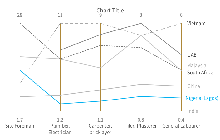
The final touch is to add a title that clarifies content and message:
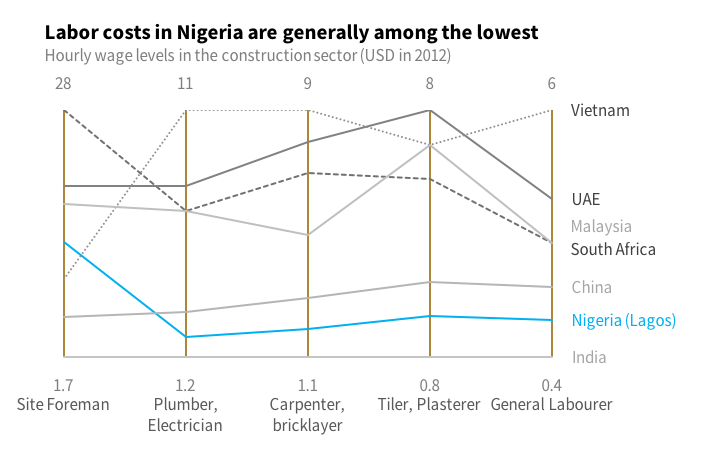
This graph can be found in the report “Housing Finance in Nigeria“, World Bank Group, 2016.
Francis Gagnon is an information designer and the founder of Voilà: (2013), a data visualization agency specialized in sustainable development.