
 Source: Wikipedia.
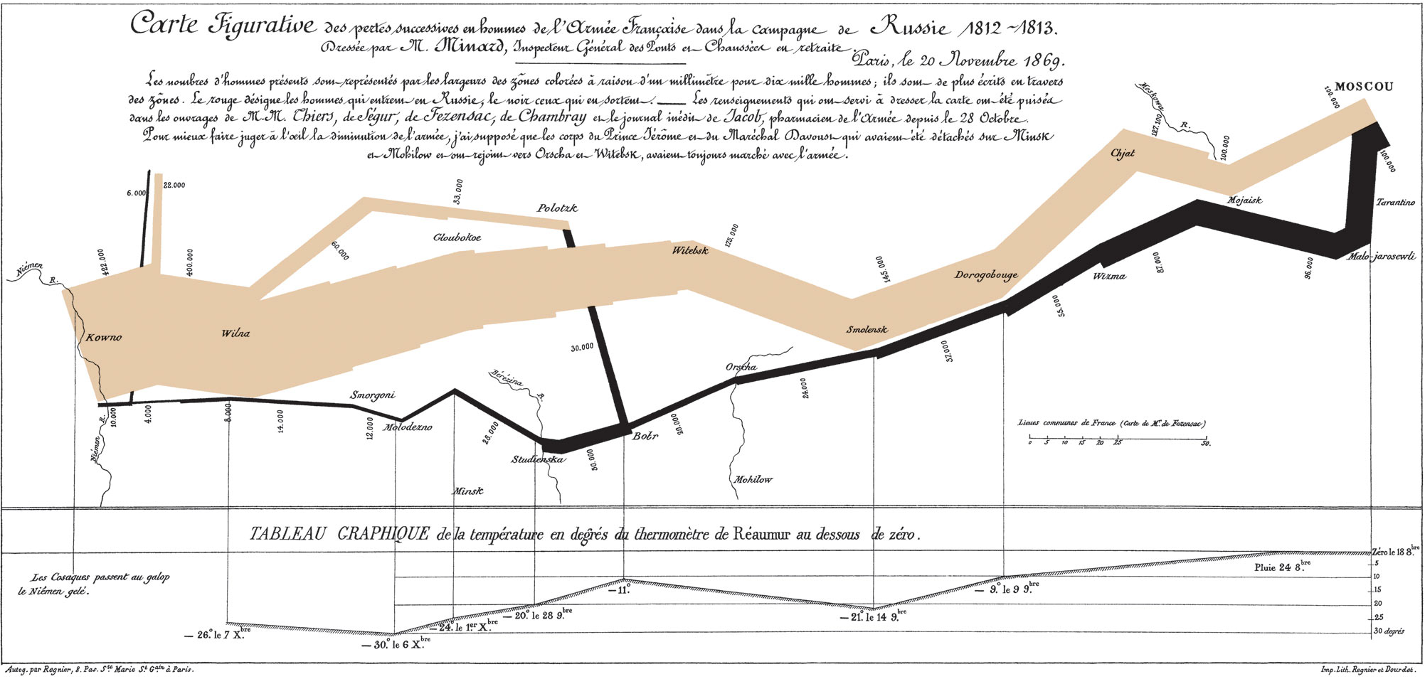
The map representing the Russian campaign of the French army in 1812 is a true celebrity of the data visualization world, mostly known for its spectacular features. Lines show the number, location and direction of the army troops. The temperature during the return from Moscow is shown at the bottom. The campaign was a carnage and cold weather had something to do with it. In The Visual Display of Quantitative Information (p. 40), Tufte famously writes “It may well be the best statistical graphic ever drawn.”
Yet, the map has many more features, some hidden in plain sight. Knowing that people don’t read many of the stories they share — something that affected another celebrity of information design — perhaps more is overlooked on this map than we realize.
This list doesn’t pretend to be any more than the result of a few hours of close reading and online research, but it was good geeky fun to prepare and might inform a few readers. I know I learnt more than I care to admit.
1. It was not created by Edward Tufte.
I’ve heard this one surprisingly often, even though Tufte doesn’t claim credit for it. Most people were introduced to the map by his books and conferences so it became the “Tufte map”. Credit for this masterpiece goes to Charles Joseph Minard, a French civil engineer who created the map during his retirement years.
2. The events depicted were not contemporary when the map was designed
The events took place in 1812, but Minard created the map 57 years later, in 1869, an eternity at a time when life expectancy in France was around 40 years (interestingly, Minard lived to be 89 years old). Compared with today’s longevity, it’s the equivalent in terms of generations of creating now a map of World War I (1914-18). This was already a historical map when it was designed.
3. This map is the last of several works of Minard
In Beautiful Evidence, Tufte mentions that the map “is the last sheet in Minard’s portfolio”. He had accumulated experience from the creation of some 51 thematic maps.
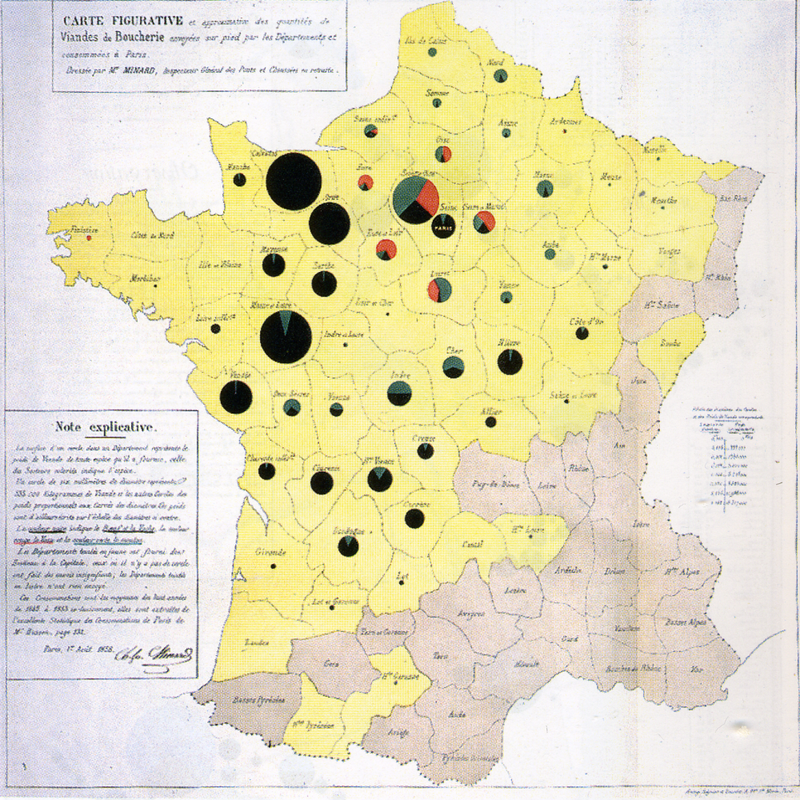 Cattle map, by Minard. Source: Wikipedia .
4. The march doesn’t start in France
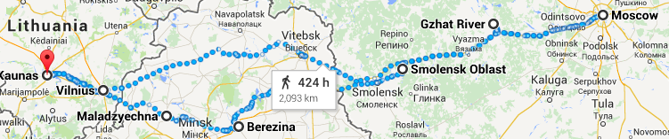
It starts in then-Poland (now Lithuania), at the Neman River, quite far from France. This might not be self-evident to the reader, given that Napoleon was French, and that the countries are not mentioned on the map. By the way, Google Maps estimates that the trip from the Neman River to Moscow and back would take 20 days of non-stop walking. The campaign lasted 174 days.
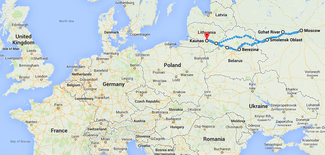 Very approximate path of the French army.
5. The map doesn’t show the main cause of the losses
It is tempting to attribute the losses to the cold weather on the way back from Moscow, but a careful reading of the map shows otherwise. By the time Napoleon reached the capital, he had already lost some 75% of his troops (322,000 out of 422,000). The main cause was starvation because the retreating Russian troops were burning the land, villages and crops to deny food to Napoleon’s army. The cold weather and battles on the way back took “only” another 20% of the original troops.
6. The map doesn’t mention Napoleon
Even though this map is known by some as the “Napoleon map”, Minard doesn’t mention him. Tufte’s theory, based on Minard’s biography, is that “full attention is to be given to memorializing the dead soldiers rather than celebrating the surviving celebrity.” (Beautiful Evidence, p. 136) In fact, Tufte suggests that this is an anti-war map, from the way it stresses the catastrophic human losses.
7. Tufte admires several features that receive little attention
The maps is a tour de force and might intimidate those who want to produce good work, but Tufte praises some very accessible features of the map
a) The author identifies himself.

That’s one easy takeaway from the Minard map: always sign your work. Tufte says: “authors must be named”. (Ibid, p. 132) In a bureaucracy, it can be especially difficult to convince people to do this because they fear both taking credit where a team deserves it, or taking the fall when they had limited control over the product. Tufte continues:
“Publicly attributed authorship indicates to readers that someone is taking responsibility for the analysis; conversely, the absence of names signals an evasion of responsibility. (…) Authorship credit is too often absent from corporate and government reports; we should remember that people do things, not agencies, bureaus, departments, divisions. People may do better work when they receive public acknowledgement and take public responsibility for their work.”
b) It reveals sources.

Minard lists the five sources of its data, including the unpublished diary of the army pharmacist. From this, Tufte derives his fifth principle of analytical design:
“Thoroughly describe the evidence. Provide a detailed title, indicate the authors and sponsors, document the data sources, show complete measurement scales, point out relevant issues.”
c) It integrates evidence. This is a good example of something so well done that it becomes invisible. All the information you need is there where and when you need it. There’s little that is “clumsy” about this graph. Now I admit, this one is more difficult to achieve.
“Minard brings together various modes of information in order to describe troop movements and the war’s consequences: a paragraph of words, a map with narrating flow-lines, and a statistical graphic dangling from the map. (…) A deeper understanding of human behavior may well result from integrating a diversity of evidence, whatever it takes to explain something.”
8. The orignal is in French
It is perhaps unsurprising given the French origins of the map, but since Tufte sells both versions, most people seem to have seen the English one. I also suspect that few people get close enough to read the text. Edward Tufte is the source of the translation — see The Visual Display of Quantitative Information, page 40, and his sales page, where he refers to “our new English translation“.
Update (2016-05-21): Tufte credits Dawn Finley for the translation and Elaine Morse for the redrawing (Ibid, p. 124).
9. It has a long-lost sibling
The map was published as part of a lithograph of two maps, the top one representing a campaign by the military commander Hannibal, some 2000 years before that of Napoleon. A similar scenario played out, whereby Hannibal lost 70,000 of the 96,000 troops he had at the start.
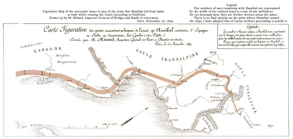 Version translated to English. Source: EdwardTufte.com . See Beautiful Evidence p. 135 for the complete lithograph with the two maps.
There is one artifact of this separation on the Minard poster: the top line of the frame surrounding the map is double only at the top, the top line being most likely the bottom one of the Hannibal map above.
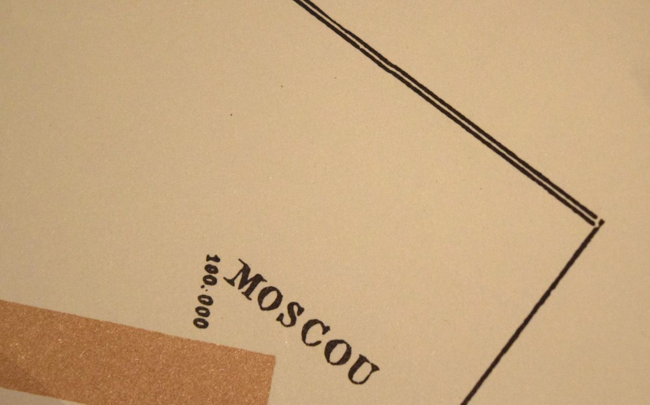
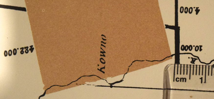
10. The representation is inaccurate in crucial ways
a) Minard acknowledges that himself.

English version:
“In order to better judge with the eye the diminution of the army, I have assumed that the troops of Prince Jerôme and of Marshal Davoust who had been detached at Minsk and Moghilev and have rejoined around Orcha and Vitebsk, had always marched with the army.”
Minard admits that his visual representation is based on certain choices that sacrifice accuracy in favor of the story. Orcha and Vitebsk are about at the halfway point. Without knowing the size of these troops, it is hard to know how much of an impact this would have, but one thing is clear: it would make the comparison of the initial and final number of troops, at the Neman River, less dramatic. Also, it is doubtful that the troops returned so far South from their departure point, but likely that it is a design choice by Minard who could not overlap the two lines. In fact, Martin Grandjean suggests based on historical documents that the movement of troops was much more complex than shown by Minard.
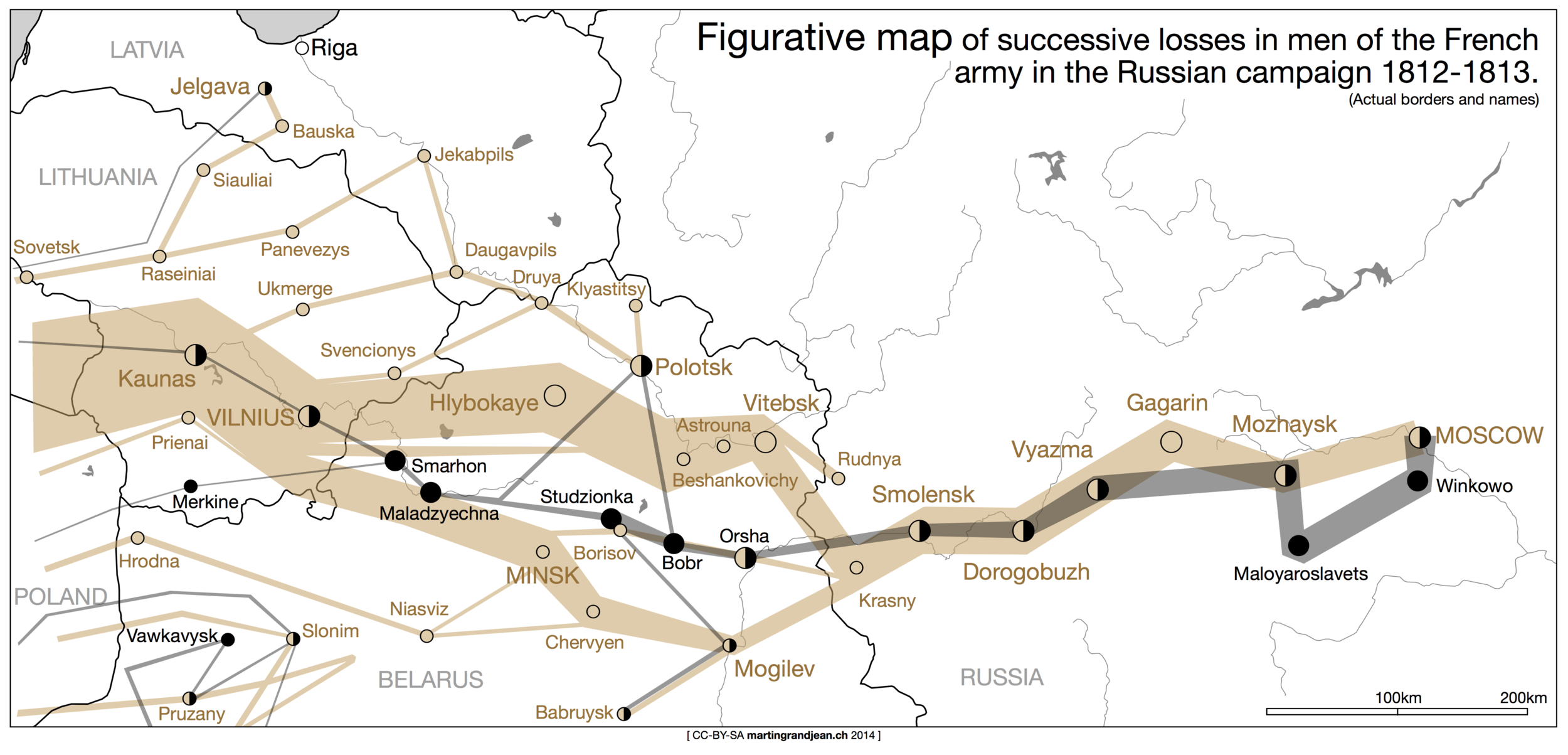 Source: Martin Grandjean.
b) The visual representation of the final number of troops is exaggerated. The legend says that 1 millimeter equals 10,000 troops, but where the label indicates 10,000 returning troops, the line is closer to 2 millimeters, almost twice the accurate size.

A side note about the army losses: they were not only deaths, but also desertions, wounds, diseases and prisoners.
c) The north is not exactly at the top. If there was an arrow indicating the north, it would lean slightly to the left. Kaunas, the departure point, is at 54° 53′ 50″ N while Moscow is less than one degree north, at 55° 45′ 0″ N, A map with the north perfectly pointing at the top would show a flatter path, a lesser upward trends towards the right. It is surprising that the map should miss a north-arrow.
11. Temperatures are in an old-fashioned scale
The temperature scale at the bottom is not in Celcius, but in the scale of Réaumur, whereby water freezes at 0 °Ré and boils at 80 °Ré. So when it says that the temperature reached -30 °Ré on the 6th, it was actually -37.5 °C (-35.5 °F). Things were worse than they look if you mistakenly assume that the temperatures are displayed in Celsius. Tufte’s translation, however, adds the Celsius and Fahrenheit scales.


 Source: Wikipedia.
12. There’s a mystery around the color of the Eastbound line
I see it beige and Tufte calls it tan, but Minard describes it as red. Is it because the word had a different meaning or because the original map has discolored over time? Since the French word “rouge” designates the color of blood since the 12th century and that “beige” exists in French since the 13th century with its present meaning, one would think that the color might have changed over time. But Tufte thinks that the line was never red because the originals are well protected and show the same tan. Also, Minard used red on other maps and it is still bright today (Ibid. p. 131). So, what gives?


13. The map doesn’t have its own Wikipedia page
For now, it only has a section on the page of Charles Joseph Minard. Yet, the image appears on more than Wikipedia 500 pages although not all of them are articles; some are talk pages, user pages, etc. It might only be a question of time before someone creates it.
14. Bonus
There’s something more we can learn with your participation: which of these things are most and least known? Answer below on which things you already knew. No need to brag: it’s anonymous — you can brag on Twitter though.
Can you continue this list? Fire away in the comments below.

