One of our data overlords, Google, organized a massive open online course (MOOC) called Making sense of data from March 18 to April 4. It was nowhere to be seen on my social media after the announcement, which is surprising given that I follow a lot of data folks. It made me wonder who had taken the course.
But before, a few words on the course. It is not the ambitious program that some might expect coming from a data-centric organization like Google. It conveys some basic notions of data manipulation and remains fairly easy. Getting 10/10 on the pre-course assessment made me doubt whether I should continue. I wasn’t the only one with concerns.
I’m taking MOOC by @google on data interpretation. Never studied this before and got a 90% on the assessment test. That worries me.
— George Karmokolias (@TheKarmiDance) March 24, 2014
The course was structured around the exercises, meaning that students were first asked to try their hand at the exercises, before diving in the material to figure out what they were missing. This is much more in line with how I learn in the real world and I was happy to see that Google had some of their own research on learning to back their approach.
The meat of the course is in learning to use Google Fusion Table. This sort of spreadsheet web app can be convenient (merging spreadsheets is very easy), but it can also be maddening. It has a habit of creating bar charts that do not start at zero — far from it — that is just vexing. There’s no undo. The lack of control over the legends gets in the way of creating a clear chart. The “summary” feature appears like a pivot table, but then it’s not — at all. I failed at creating tables and charts that would have been fairly simple in Excel. Tables and graphs are created separately, meaning that you cannot build a chart on top of a table you put together. In charts, you can only order the data by performance or alphabetical order, not very useful for ordinal data like ratings. Here’s an example where the chart is rendered useless by this limitation. Read it carefully because the visual lies.
This graph is based on a random sample of 8000 responses to the background and mid-course questionnaires, made available by Google. The data appears to be representative, so let’s have a look at who took this MOOC.
One way to check if data specialists registered for the course is through the question about the frequency of interaction with data. Since a majority of people responded that they work with data daily or weekly, it seems that Google didn’t attract a majority of amateurs.
Then again, a majority had taken one or no statistics class. It might be a witness to a rapid growth of data in the workspace in recent years, where education hasn’t caught up with the job market. Or perhaps data falls on unsuspecting people.
Some numbers suggest that students found the first two units to be easy. Their self-rating to the question “I believe I am good at working with data” went up, with low ratings 1-3 decreasing, while high ratings 4-5 increased. Perhaps Google meant those units to be encouraging first steps, to keep students going.
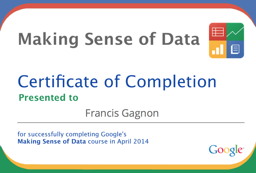
(By the way, this graph is the masterpiece of my final project, giving you an idea of the level of difficulty to obtain the certificate,)
Students ended up with a rather goofy-looking certificate that might reflect the amount of effort they had to put to obtain it. What more do you want for one day of work?
The course doesn’t take long. It can probably be done in six hours at a normal, non-obsessive, pace. Those who reported completing units 1 and 2 (about halfway through the course) estimated that they had invested 3 to 5 hours so far. Apologies for the graph below (can’t order, etc.)…
It is now too late to get the certificate, participate to the “hangouts” and the discussion forums, but the material is still online. Unless you were after the certificate, don’t worry about coming late: very few students actually used the forums among those that reported completing units 1 and 2.
Given my experience with the Knight Center’s MOOC on data visualization, the poverty of content and interaction was a disappointment, although not a surprise since it was not mandatory.
It looks like there is demand from people who deal daily or weekly with data, yet have no formal training. Given that these people are already on the job market and unlikely to return to school, the profile of the participants suggests that there might be a good market for flexible, online courses about data. Let’s see if Google and others follow up to tap into this market.