Forbes has a makeover contest for this graph.
Gavin McMahon, from Powerful Point, did this version and I explained in the comments what I thought was wrong with both versions.
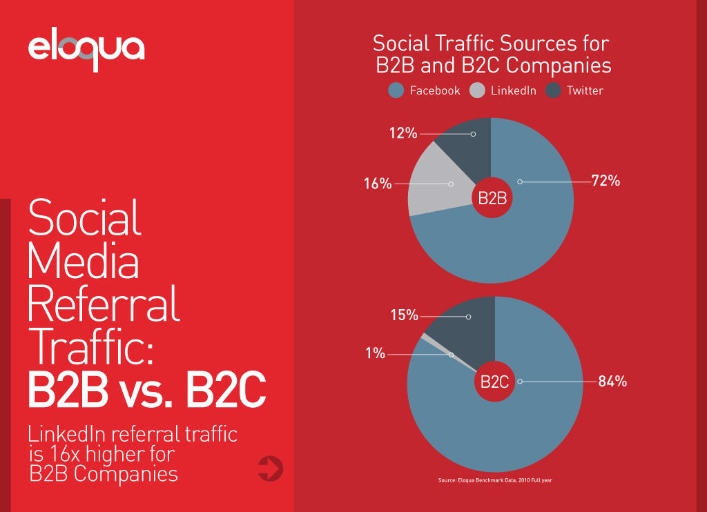
The main problem is that the headline is plain wrong. The data presented here does not imply that LinkedIn referral traffic is 16 times higher for B2B than B2C companies. This graph does not even give the data to make this statement because we don’t know how many referrals each type of companies get. What we have is the shares of the referrals by three social media. This is not a small point: if you’re a B2B company investing your advertising money in social media, you would be wrong to think that you would get more clicks through LinkedIn than a B2C company. You might just get less clicks through Facebook.
The second problem is that the headline does not match the visualization. In the headline, the authors compare B2B and B2C companies. In the graphs, they primarily compare the social media share for each type of company. If the comparison should be LinkedIn to LinkedIn, then show it.
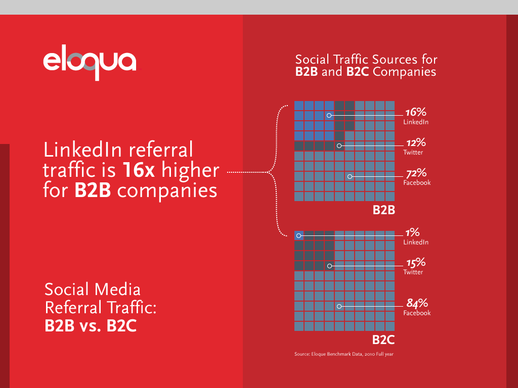
After that, I felt I had to put myself out there and make a proposal. Here is my version.
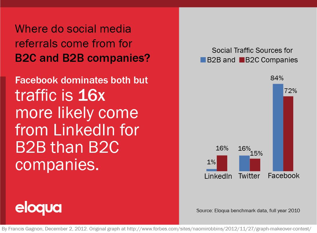
Gavin took the slide to a higher level though by focusing on the main message. I thought that the message went beyond LinkedIn and that the dominance of Facebook was part of it. After all, despite the LinkedIn gain, a B2B company would be wise to continue investing mostly in Facebook according to this data. I also felt that the title was not clear enough so I rewrote it.
The “parts-of-a-whole” is not the main story here, so there is no need to use a type of graph that shows it. The story is the difference in the share of LinkedIn referrals, along with the dominance of Facebook in both cases. I chose a bar graph because it conveys directly the messages in the data: Facebook is big, LinkedIn varies a lot. Joe Mako made a slopegraph that has the advantage of showing how twitter and LinkedIn swap second position, but there seems to be too little data to use such a rare graph.
I kept the color scheme because I understand that this is meant to be eye-catching. Personally, I wouldn’t use so much red. I put the company logo at the bottom, out of the way of the main message. My version is less pretty than the original, although I hope it is more accurate and makes it easier to understand and engage with the data.
I don’t dislike pie charts all that much, but I rarely find a use for them. This particular case is not about getting rid of pie charts, but about using a visualization that is appropriate for the data and the message.