Part II of my observations from the World Bank Data Dive on poverty and corruption.
It might start with the data, but for me the fun is in the analysis, especially visual. I had in fact joined the group fighting corruption because they seemed the most likely to need data exploration and visualization.
Below is the result of a long day’s worth, more or less. I wish I had a graph shining the light of integrity on collusion, coercion or some other evil, but no. Slowed down by data issues, we did not make it that far. I can’t say that I’m satisfied with any graph I’ve done over the week-end but then again, I’ve done them.
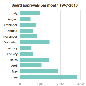
The first one happened while I was idly playing with the project data. By déformation professionnelle, I looked at the number of projects that the Board of Directors had approved per month. With July at the top, it is clear that there is a rush to approve more projects towards the end of the fiscal year, in June.
Is it possible that more cases of corruption happen in projects approved in May and June because the staff takes less time to conduct the due diligence? This question opened the Pandora box of linking disbarment data and the project data. If we were to find project characteristics that lead to higher likelihood of corruption, it could orient the preventive work of the integrity team. It was too much to resist and became our undoing as we spent hours trying to recreate that link, leaving available data sets unused.
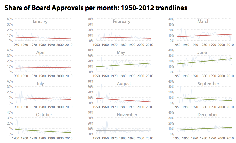
While the true wizards were working on said link, I continued to explore visually the project data. My original graph showed cumulative approvals for 66 years. What if this bunching is an old problem and that the Board now approves a constant number of projects per month? I needed a trend.
I’m afraid this is my best effort of the week-end. About 800 data points visible with a clear enough message: the trend has worsened over the decades and the Board approves a growing share of projects towards the end of the year. The months with a larger share have gotten an increasing share vice versa. Since the mid-1980s, the share has reached 30% regularly in June. This is nearly four times as much as would be expected from an equal distribution per month (1/12 = 8.25%). This finding confirmed that it was still worth exploring the impact of this share of approvals on the due diligence of individual projects. Unfortunately, the data materialized too late and the link was never explored.
We did get an original data set though: the historical list of firms and individuals disbarred by the World Bank. I’m afraid I did nothing worth sharing with it. A few bar graphs showing the number of firms, the average number of days of disbarment per country. No corruption fighting histogram in there, no revolutionary radar graph.
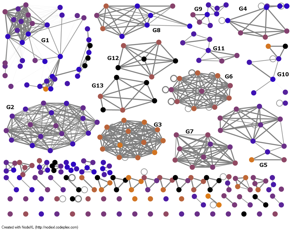
In lieu, here are two of the most interesting visualizations I’ve seen. The first one is a network diagram of the bidders on World Bank contracts built by Nick Violi with data that he scraped himself (wow). It draws no conclusion, but it makes me curious. What are these clusters? I don’t even know what the colors mean, but I’d like to know why some clusters are all yellow, some are mostly blue and some are mixed. G11 is an interesting nod, as it bids on few things but then bids across two clusters. What kind of company can it be? This is the kind of exploratory visualization that makes me want to dive into the data.
The second is from a team exploring UNDP’s resources allocation. In a scatter plot, it compares the overhead with the expenses of, apparently, hundreds of projects. It might look like a Caribbean hurricane to you, but to me the resulting distribution of the data is surprisingly elegant. The two measures have expenses in common, which accounts for the slope pattern. The horizontal cut-off at 1.0 is due to budget limits (or one hopes). The color overlay provides a nice analytical tool, suggesting to the reader where to look and how to interpret the data. There are a few startling findings already. A surprising number of projects have spent 2-3 times as much in overhead as in operations. Despite the high quantity of outliers, there is a strong concentration of projects around the target of spending 100% of budget and keeping the overhead low, which suggests good planning and lean implementation.
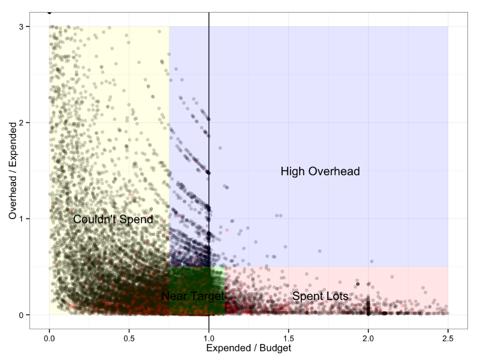
This graph would benefit from some graphic design flair. The overlay text should be readable and aligned everywhere. The overlay colors could be more visible and helpful. I’d be curious to experiment with empty circles instead of semi-transparent ones. The vertical text could be made horizontal. The light grey frame could be removed.
Knowing the conditions in which these graphs were produced, I wouldn’t take the data for granted, nor draw any hard conclusion. But they might inspire a few in-depths analysis. Have a look at a few more on this Tumblr.
Thank you but mostly congratulations to the organizers at the World Bank and DataKind. For an event so open, it is impressive how purposeful it felt. A special thanks to the to data ambassadors of our group, Sisi Wei and Taimur Sajid. I hope that the World Bank, UNDP and other organizers and participants will benefit from the event. I know I did.