Finding the right concept is my favourite part of doing data visualisation. It depends on understanding the topic, the message and the audience and emerges through discussions with the client. Getting to that aha moment where it finally makes sense is a delight. So this is an example of when it happened not once but twice. Or perhaps only once.
In the present case, as sometimes happen, the client approached me a little late in the process: the data is all collected, analyzed, visualized even and the blog post is written. That’s when they realized that their graphs didn’t look the part and they called me.
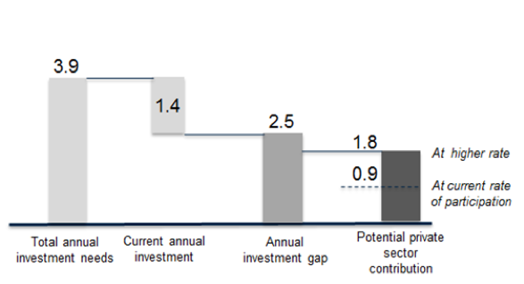
The topic is the investment needs of developing countries to achieve the Sustainable Development Goals. They are huge and they are not met. And it will be very hard to meet them, even in the rosiest scenarios. This is their original graph. The numbers represent trillions of US dollars per year.
After a quick look at the chart and a discussion with the client, I thought that the best metaphor would be an area, a container, representing the needs that needs to be filled with investments. I suggested a waffle chart and they agreed, so I developed the concept below.
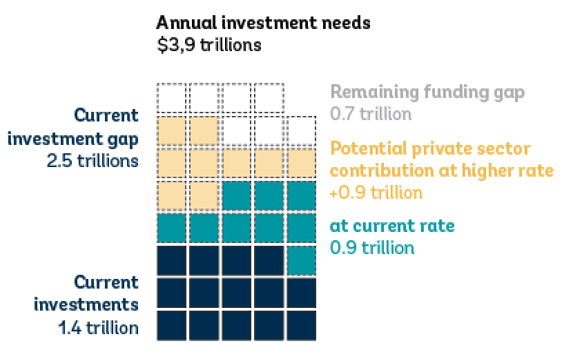
Even though this is my final draft, after much iteration, it didn’t quite work as well as I expected. It’s not unusual: graphs need to be tested with real data to know if they work. In this case, the idea of a container was more or less lost and it looked more like some compilation of several categories. The labeling was awkward too and I had to use two very different colours to clearly differentiate the labels of “current” and “higher” rate of private sector contribution.
Before even going back to the client, I knew I had to develop another concept. I thought that a simple stacked column chart would convey better the idea of a container getting filled, but leaving a gap at the end. Here is my first attempt.
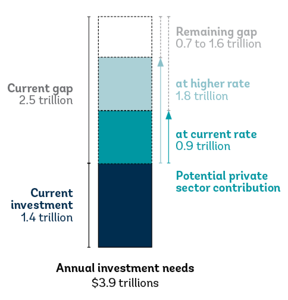
I started at the bottom because that’s how containers fill up. It created a bit of awkwardness on the right-hand side as the “current” and “higher” rate scenarios are seen above their title of “Potential private sector contribution”. Also, I had to use a lot of arrows and lines to explain the different categories, which is not a good sign. Since we had discussed that a sizeable proportion of their visitors arrive on (small) mobile devices, I decided to flip the chart upside-down so that the reader scrolling on a phone would see the headline first and then the current situation, followed by the likely and less likely scenario, ending with the gap.
It seems like a better ordering, especially as the column description (top) can act as a title and the awkwardness on the right-hand side is reduced. It didn’t resolve the multiple explanatory lines, but it was my best option.
So I sent it to the client. And the client didn’t like it. They found it harder to understand than their original cascade chart. This sent me back to the thinking board. Ditching my original instinct that a container was the best metaphor, I looked much more closely to the cascade chart to see what was wrong with it.
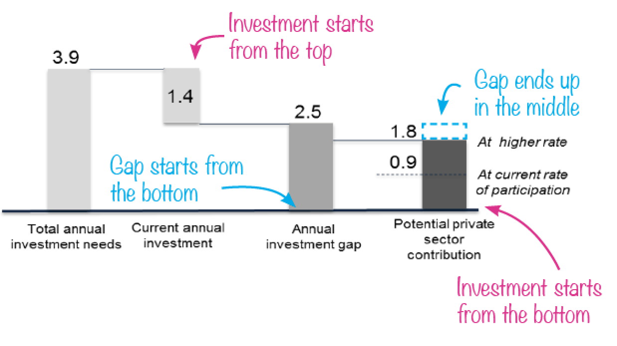
It became clearer why it wasn’t working.
- The direction of the investments changes: “current investments” starts from the top, then ”private sector investments” starts from the bottom. This switch in convention makes the chart harder to understand than it should and the final gap ends up in the middle, rather than at the bottom like the current gap.
- The main data point of the graph is implied and not shown, namely that there will still be an investment gap after the private sector investments, even at the higher rate.
- A gap is a negative number and should be shown below the line, not above, with investments going up, not down.
- It was also missing units.
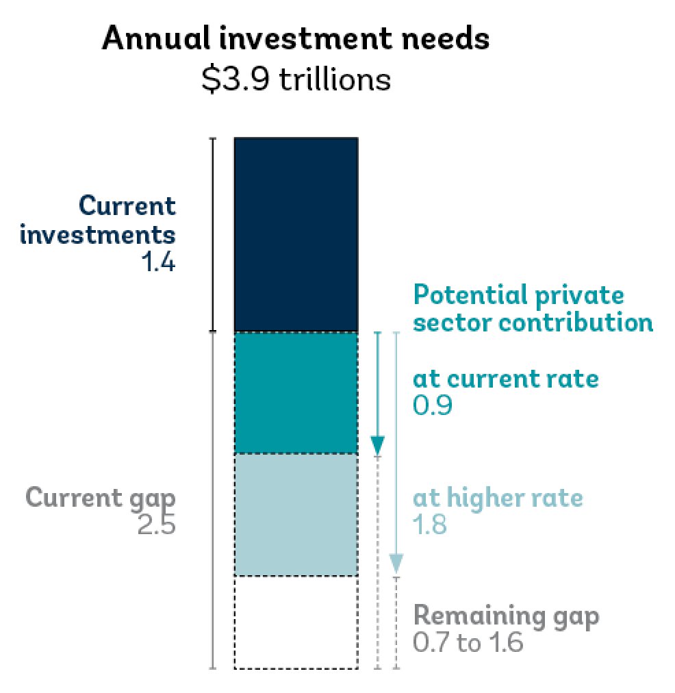
I decided that maybe the concept was right, but the execution was wrong. So I toyed with the cascade graph, trying to change the order of the categories, showing the gaps as empty boxes, tweaking the labels, etc. Unfortunately for this post, I didn’t keep all of my iterations, but there were many. It was hard to make it work. One of the challenges is the two scenarios for the private sector contribution. The higher rate ($1,8 trillion) comes on top of the current rate ($0.9 trillion), so it can be an addition (+0.9) or its own number. Here is my proposal.
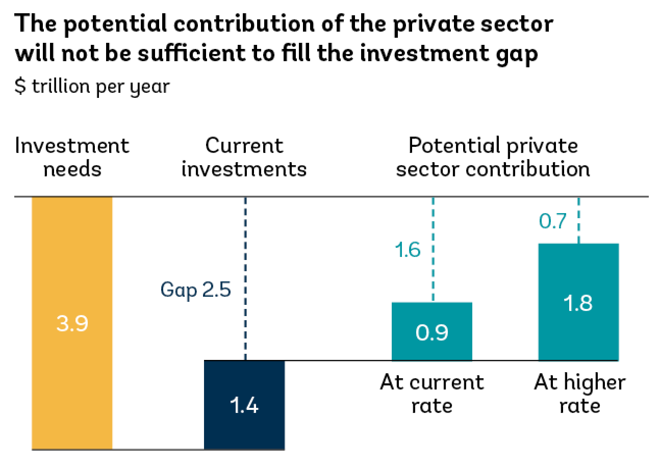
This addressed the issues I had seen on the original cascade.
- The investment needs go down, the investments go up.
- The categories are now at the top, which may work better on mobile.
- The gaps are visible, differentiated and labeled.
- The unit is included, only once.
This version clicked much better with me. No more awkward labeling and lines to explain how it works. While the columns could have been the same colour, I used different colours to differentiate the categories and join the two scenarios. It feels more intuitive. This iteration also made me realize that we had not yet chosen a title that guides the reader so I suggested one.
I have a principle that a good graph should suggest what should be, hence what is wrong or unusual with the current situation. In this case, the dotted lines of the gaps do this job. They show that the bars should be reaching the top, but don’t. This gap should lead the conversation and is now unmistakable, while it was only implied in the original.
This time, the client liked it right away. “looks great”, “like the new title”, “nice!”
What do you think?
Francis Gagnon is an information designer and the founder of Voilà: (2013), a data visualization agency specialized in sustainable development.