If you’re looking online for a data visualization training, it’s likely you’ve come across Cole Nussbaumer. That’s what happened to me when I registered for what turned out to be her very first public workshop, after years of teaching at Google and to other organizations. She describes her views and teachings in various articles, but here she’s agreed to speak more about her personal journey and what she observed from her clients. Click for the full interview
1. How did you become interested in data visualization?
Career-wise, my jobs have always been in analytics – first in banking and more recently at Google. I tend to migrate towards roles that sit at the intersection of the highly technical statistical stuff and business. My educational background is in mathematics and business, so I feel like I can talk to both sides (given that they don’t always speak the same language!) and help them to better communicate with each other. I love being able to take the science of data and use it to inform better business decisions. One key I’ve found over time to being able to do this well is the ability to communicate effectively visually with data.
I initially recognized the value of being able to do this well in my first job out of school – I was working as an analyst in credit risk management (before the subprime crisis and before anyone really knew what credit risk management was). My job was to build and assess statistical models to forecast delinquency and loss. This meant taking complicated stuff and ultimately turning it into a simple communication of whether we had adequate money in the reserves for expected losses, in what scenarios we would be at risk, and so forth. When it came to the communication piece, I saw it as my opportunity to play a little and be creative. I learned quickly that spending time on the aesthetic piece (something my colleagues didn’t typically do) meant my work got more attention by my boss and my boss’s boss. For me, that was the beginning of seeing value in spending time on the visual communication of data.
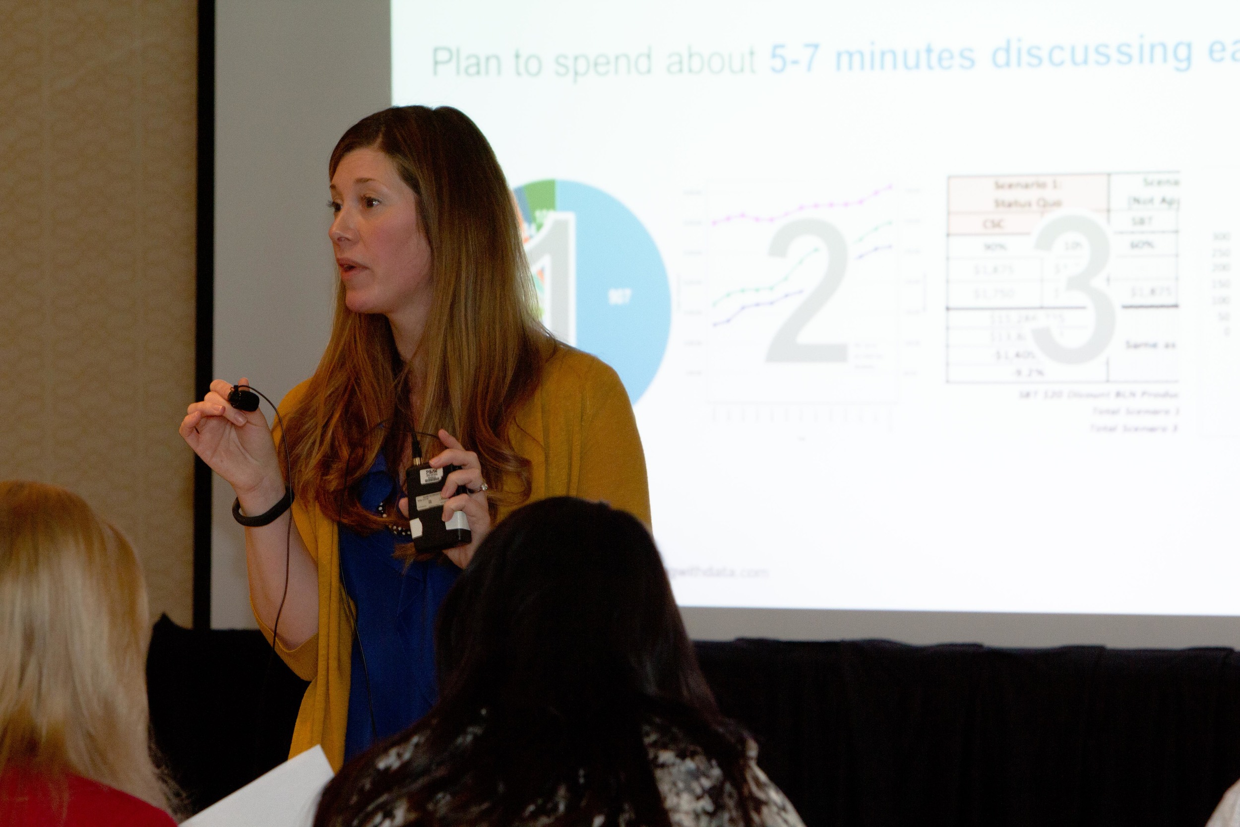
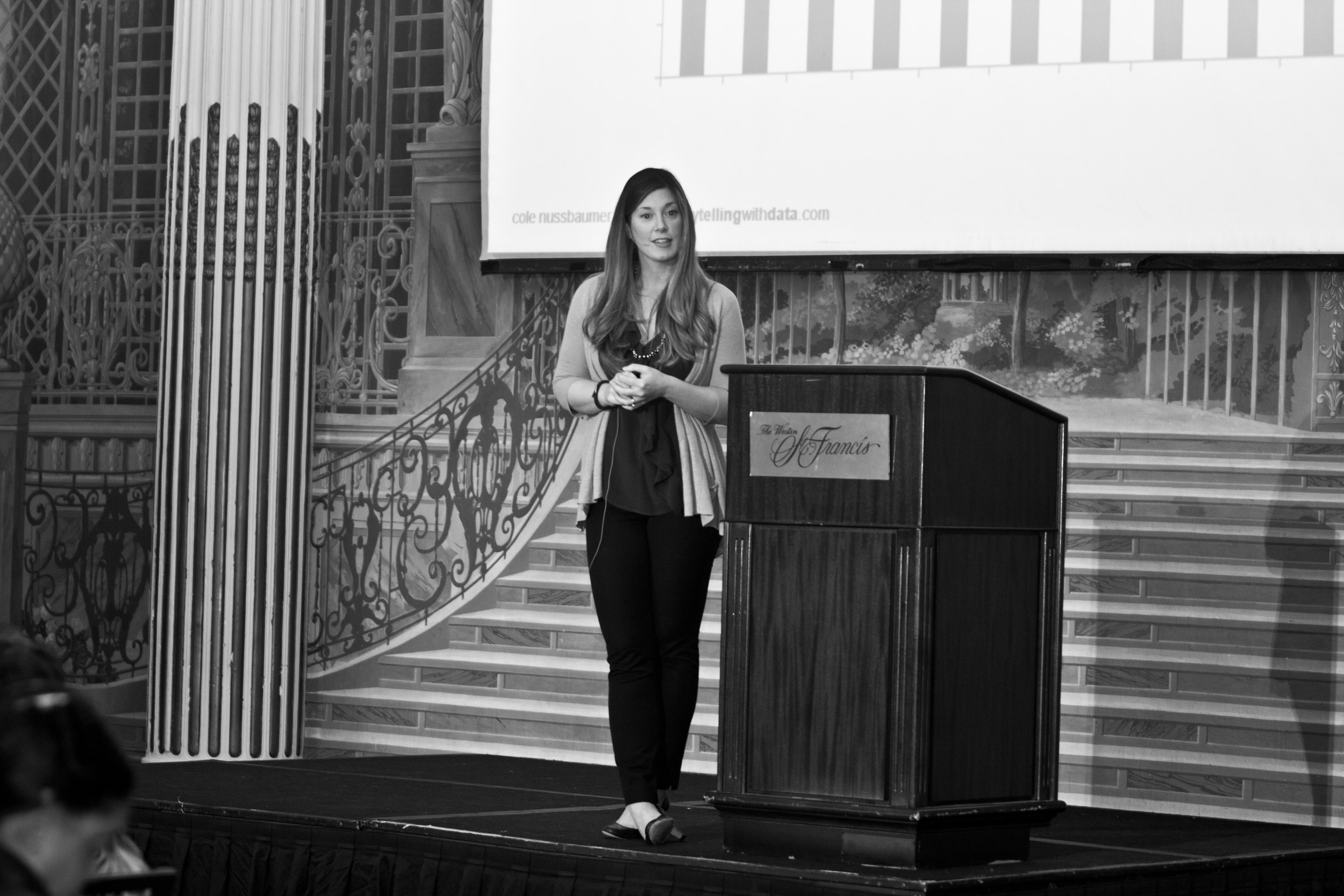
The big turning point for me came at Google. We were buidling out an internal training program and I was asked to develop content on data visualization. This gave me the opportunity to research data visualization and start to understand the principles behind effective data visualization – helping me understand why some of the things I’d learned through trial and error over the years had been effective. With this research, I developed a course that I taught at Google for a number of years. I love this space. I enjoy the challenge that comes with presenting complex stuff in a clear and straightforward manner. And I’ve found that I also really enjoy teaching others how to be better at this. As part of my work in this space, I also write a blog that can be found at www.storytellingwithdata.com.
2. You worked at Google for six years. Could you describe your role there and how Google uses data visualization internally?
Sure, I can talk about this at a high level. At Google, I worked on the People Analytics team. This is an analytics team that’s embedded in Google’s HR function, My focus was to promote better decision making with data and create innovative analytics in areas like employee engagement, manager assessment and development, organizational planning, and attrition management. I won’t speak broadly about how Google uses data visualization, but on our team we used it to help communicate the findings of our research and analytics. When you need to convince someone to do something differently or take some sort of action, showing the evidence in the data can be a really effective way to do so.

3. Can you tell us why you recently left Google and share some details about your plans?
Leaving Google was a difficult decision. It really is a magical place to work and I honestly can’t imagine working for another company (it would be hard to measure up!). But I’ve been growing my own business over the past couple of years and am very excited to take that to the next level.
I mentioned that I developed and taught a course at Google focused on data visualization. At one point, I thought – why stop there – and created content that I have used externally for the past couple of years, speaking at conferences and conducting workshops for organizations on how to communicate effectively with data, or what I’ve come to call “storytelling with data”.
I’ve found that as awareness of what I’m doing in this space increases, so does the demand for it, so earlier this year I decided to leave Google to pursue my goal of teaching the world how to tell stories with data. Currently, this mostly takes the form of workshops that I conduct within organizations (more details are on my website under Custom Workshops). Recently, I also offered my first public session in Washington DC, where individuals could register and attend a half-day workshop (Francis, thanks again for attending!). I plan to do more of these in other cities (I’m nearly ready to open up registration for upcoming sessions in San Francisco and also plan to do one in Chicago in the fall; details are on my site under Public Workshops).
I’m still at the early phase of figuring out what this looks like over the long term, but in the meantime I’m having a lot of fun teaching, expanding my network, and continuing to learn in this space. If you’re interested in keeping up with what I’m doing, follow my blog or on Twitter @storywithdata.
4. You’ve visited many organizations by now: any insights on what they have in common and what differentiates their data visualization needs and skills?
From what I’ve seen, every organization faces a similar challenge: they may recognize the need to be able to communicate effectively with data, but people skilled in data visualization are hard to come by. Part of the challenge is that data visualization is a single step in the analytical process. Those hired into analytical roles typically have quantitative backgrounds that suit them for the other steps (finding the data, pulling it together, analyzing it, building models), but not necessarily any formal training in design to help them when it comes to the communication of the analysis. It’s only very recently that I’ve started to see university and continued learning programs offered in the area of data visualization; in general, people aren’t taught how to do this well and so we rely on our tools to understand best practices, and our tools can lead us in some bad directions (meaningless color, 3D that adds clutter without informative value).
In my opinion, every organization has opportunity for greater impact through upskilling their analysts in this area. The organizations that do well here are the ones who recognize the value that a well-designed visual communication can have, invest in talent (and training!) in this space, and reward those who do it well.
5. Given that many of your students must have done some data visualization before taking your class, what preconceptions or ideas do they have that you find hardest to change?
For me, any data you show has to be part of a story. I think one of the most challenging aspects for folks (and where I hear some hesitancy expressed) is moving away from showing exporatory analysis and focus on only communicating explanatory analysis. The exploratory analysis is what you do behind the scenes to help discover your story. Once you have that identified, you’re ready to build the communication, where only data you should show is that which directly supports your story and includes a call to action for what your audience should do differently with the new information you share. I think there are two main reasons this feels uncomfortable to people:
- There’s a desire to demonstrate the effort that went into the work product. When you do an analysis or build a model, often times you end up turning over many rocks to find the one or two interesting gems. There’s a desire to want to show the many rocks you turned over when you communicate your findings, because that took a lot of time and is sort of evidence of the robustness of your efforts. But this means the audience also has to sort through all of these rocks to get to the one or two important things. In your communication, you should really only focus on the one or two important things to ensure your point gets across. No data dumps.
- There’s a belief that the audience should draw their own conclusion. I often hear people say they want to show data and let the audience draw their own conclusion. For me, this is a dangerous space that should be avoided (the exception would be when you really do just want to put data out there for an audience to explore, but I would argue the need for this is rare). If you are at the point where you want to communicate something, you are in the best position to frame the context and story for your audience. Sometimes there is hesitancy to do this and people have the belief that their audience knows better, but I think that is incorrect. What I teach is that you should lead with the story and then the data becomes supporting evidence of this story. Even if you end up focusing on the wrong thing, it starts a better conversation than a data dump ever will.
Bottom line lesson: any data you show should be part of a story.
Francis, thank you for the interview. It was great to get the opportunity to meet you in DC a few weeks ago! If your readers are interested in learning more about me and my work, please encourage them to check out my blog at www.storytellingwithdata.com. Thanks very much!