After my attempt at improving the concentric circles, Stephen Few was kind enough to provide more feedback: he still doesn’t like them.
Your experiments with concentric circles are interesting and it’s clear that you’re having fun exploring this, but the new version doesn’t seem to work any better than the first, even though you’ve eliminated the one annoying illusion. We’re still left trying to compare areas, and even though inner circles make this slightly easier, the comparison still requires too much effort and time. Also, to my eyes the patterns formed by the concentric circles are hard to look at–similar to targets on a gun range–which make me a bit dizzy. I appreciate your efforts to find a better solution, but I doubt that concentric circles will prove useful.
The concentric circles don’t make me dizzy, but I agree with the core of the arguments. If the goal was to equal bricks in ease-of-reading, then yes it is a failed attempt. But if the goal was to improve on plain shapes and colors to display quantities on a map, then it seem like a fair addition to the data visualization arsenal. Circles exist and are regularly used on maps and this is a suggestion to make them a little more precise.
I made a few more tweaks to the concentric circles. Here is version 3. I am starting to think that they should have been called “circular gridlines” ever since I replaced the circumferences with colored the area.
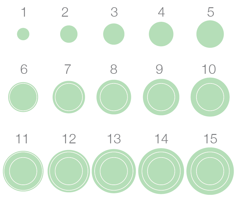
The smallest circle has disappeared because the spacing was not constant: the small circle represented 1 unit; the next circle, 5 units; and the third, 10 units (1-5-10…). Now the interval is constant at 5 units (0-5-10-15). The result makes clear that the area grows much faster than the radius. I double and triple checked my numbers, but it seems that the inner circle is really the same area as each of the two rings. Truly, these areas are counter-intuitive.
I now use white gridlines with the vague hope that they will be less dizzying, if that is truly a problem. The downside is that we can’t see when the value reaches a multiple of 5 units, like with the faint grey gridline, only when it exceeds it. That’s why I have a third row in the example above, to show more than one gridline at work. One is not limited to intervals of 5, of course, and a different interval would certainly work better in some cases.
Time to put the version 3 on a map and compare with the plain circles. Click for full size.
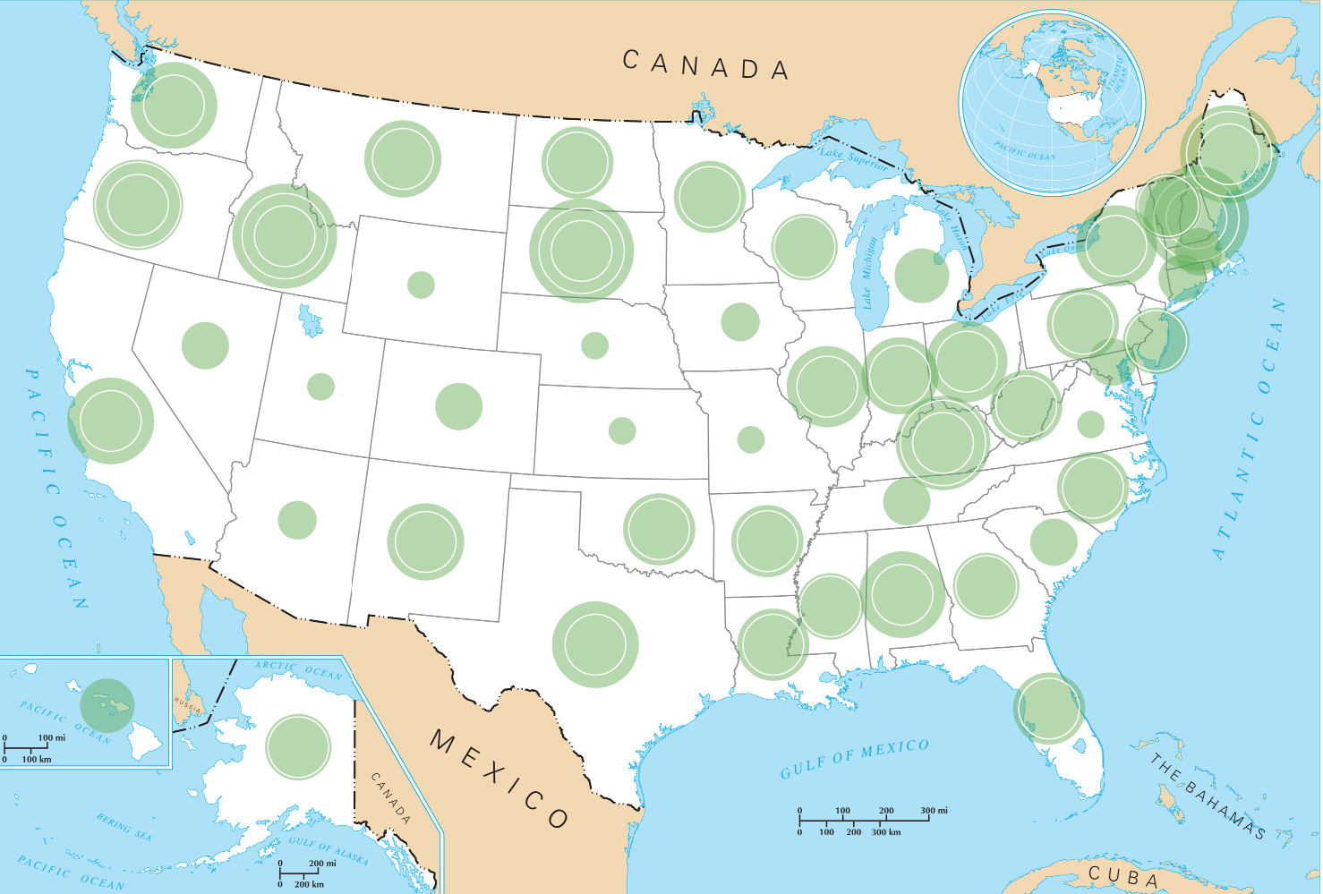
So, which one seems clearer? For testing purposes, compare Texas and Louisiana. Washington and Oregon. Oklahoma and New Mexico. In these cases, the circular gridlines help me establish which one is largest, something I can’t quite do with the plain circles.
Stephen Few has very high standards, which I respect and wish I could meet, and he wrote that he will not endorse a method that uses area to encode data. Still, this is not about getting his coveted approval, but contributing to and engaging with the larger data visualization community. I would be interested to hear what you think and to see the result if some of you ever test the concentric circles on a real project.
Note: This is a screenshot of the original poll. It is no longer active now that we moved web platform.