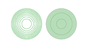
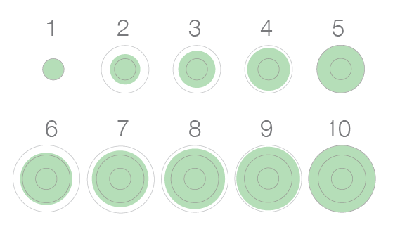
In response to Stephen Few’s challenge to do better than his bricks to display quantities on a map, I proposed the concentric circles. He shot down version 1.0:
Thanks for exploring the possibilities of concentric circles. Unfortunately, as you’ve seen, when there are more than three or four concentric circles, we cannot perceive the quantities by subitizing; we must attentively count them, which is very difficult to do because they are close to one another and hard to differentiate. Even with attention, it is very difficult to see the difference between a set of seven vs. a set of eight, and so on. Also, notice that sets of closely packed concentric circles beyond a small number create an annoying visual illusion of partially overlapping circles at the four cardinal positions (top, bottom, left, and right). You can see this especially in your map example. Even though this doesn’t work, it was definitely worthwhile to make the attempt. Thanks for the contribution.
This is fair criticism, so I went back to the drawing board. My goal is not to match or exceed the bricks, which I think do a fine job on the preattentive side, but rather to improve on the circles to convey quantities on a map. These were my challenges.
- Get rid of the optical illusion.
- Preserve the capacity to overlap.
- Make the quantities easier to perceive.
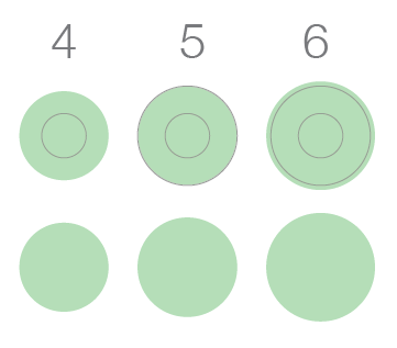
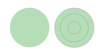
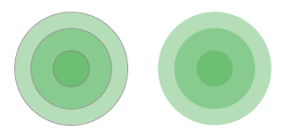
Here are the concentric circles version 2.0.
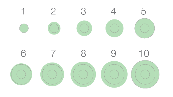
The colors is now on the area instead of the stroke and there is a circular gridline every 5 units.
This design is less busy and does not create the optical illusion of version 1 at smaller sizes and lower resolutions.
The concentric circles can still overlap and preserve their shape.
And the circular gridline allows to see when certain thresholds are crossed on the circle, something that is not possible on a plain circle.
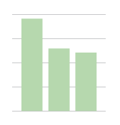
It is not possible to interpolate precisely between gridlines. Columns and bar charts suffer from a similar problem, but they hold two advantages. The first is that they generally have a gridline that exceeds the length of the longest column or bar.
The concentric circles 2.0 could do the same thing.
I don’t want to discard this solution entirely, but I am concerned that we will perceive the outer limit more than their colored area and overestimate the size of the circles. The cost seems to outweigh the benefit.
The second advantage of the bar is that the distance between the gridlines is constant. In a circle, it is well-known, the distance between the circumferences of concentric circles with areas of equal intervals gets smaller as they area grows. It is unlikely that people will adjust their perception of the distance and scale between each circular gridline.

I am not sure how much of a problem this is, considering that we are not aiming for the precision of a table, but rather for a visual method that allows a fair approximation. Still, the approximation is likely inferior to that of the column and bar charts.
The contribution of the concentric circles is that they make this confusing property of areas visible, while the plain circles do not.
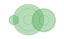
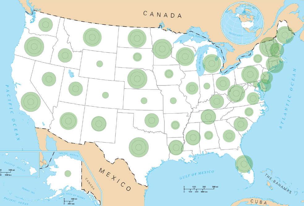
Enough parading, time to put the concentric circles at work on a map. Click for real size.
Compare with the plain circles.
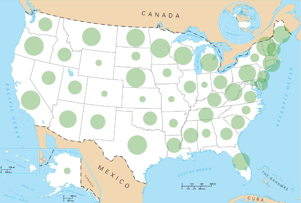
So, is it easier to visually estimate quantities with the concentric circles? The slight difference between Arizona and California seems more visible with the concentric circles, and easier to perceive than with version 1.0. The difference between Oklahoma and Louisiana, at least to my eye, is perceptible with the concentric circles, but barely with the plain circles.
Click below to see some other experiments that I discarded or keep for later versions.
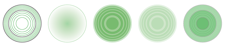
The first one was inspired by a suggestion from Taimur Sajid on Twitter and it put me on the scent for the version 2.0 (thanks!). I find it too busy though and prone to the optical illusion and difficulties of counting rings. The gradient was too hard to test at different sizes (!). The other three are still too busy. There are still two options that hold potential however.
The shades replace or complement the circular gridlines. I ran out of time today to test them. I am concerned, however, that the shading will interfere with the transparency when circles overlap. Still, it could either reinforce the visual encoding for quantities, or simplify the design in the case of the one without strokes.
Finally, I used many of the default settings of my software. There’s more to try with different colors both for the area and for the strokes to make the concentric circles clearer. I look forward to the discussion, hoping to see more people weigh in because there is much to gain from a clearer depiction of quantities on a map or with areas in general.