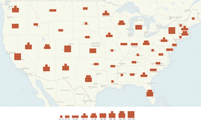
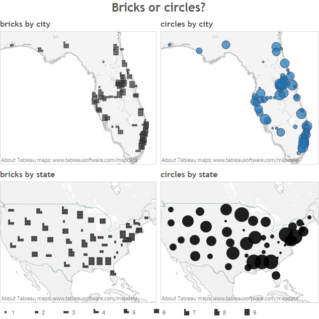
Stephen Few introduced “bricks” a few days ago as a new way to display quantities on a map. Using circles is tricky because humans are not skilled at distinguishing areas. Few suggests that we can distinguish the shape of the bricks arrangement and hence count them more easily (“preattentively”).
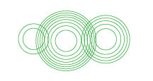
The problem arises when bricks overlap, as demonstrated by Andy Cotgreave, from Tableau, and acknowledged by Stephen Few.
Few invited – challenged – his readers to build on his proposal, so I would like to add concentric circles to the discussion.

It seems to me that the main issue with plain circles, the one that Few is addressing with bricks, is that they barely send a signal when they grow. A circle representing 8 units looks a lot like one representing 7 or 9 units.
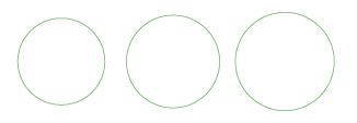
Bricks on the other hand adopt a new shape, so it is very easy to see the difference.

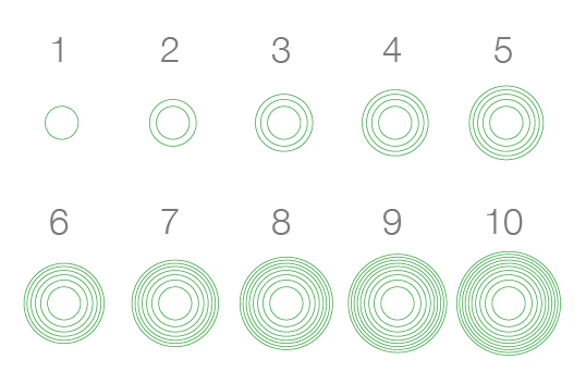
Concentric circles do not go as far as bricks to show each unit, but they convey it more clearly than plain circles.
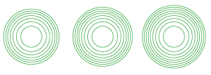
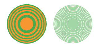
In the example above, each increase of one unit translates into one more concentric circle. Much like the plain circles, the concentric circles convey quantity by their size, adding to it the number of circles and the aspect of the outer rings. As the area grows in a linear fashion, the corresponding increase in radius diminishes and the circumference grows denser.
The advantage over bricks is that concentric circles can overlap and keep their identity.
Putting them on a map shows how their size and appearance combine to convey quantities. For instance, to my eye at least, California seems a little bigger than Arizona and, indeed, it is by 1 unit (click on map for real size). A clearer example would be Colorado and Wyoming, where the 1 unit difference is unmistakable.
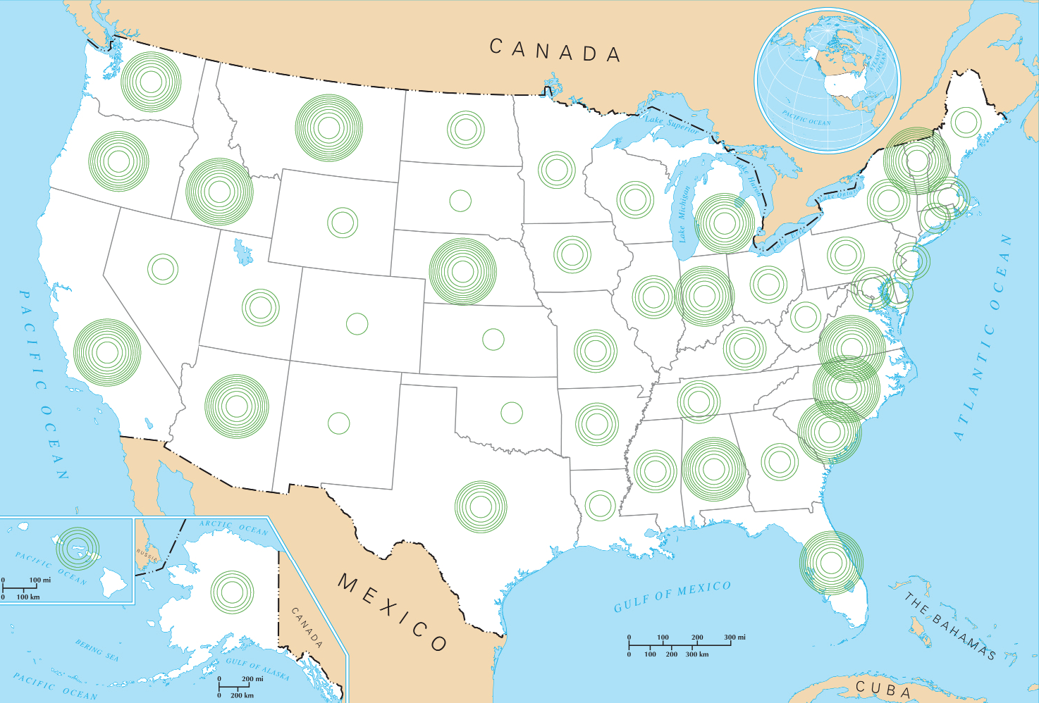
Concentric circles have their downsides.
- Above 5 circles, it is very difficult to count them. It is unlikely that a reader would rely on this method to compare quantities precisely.
- The stroke can become problematic at greater sizes, when the difference between the circles is very small.
- The visual is more complex than plain circles. This may create issues especially when interacting with certain backgrounds.
- The distinction between sizes is less clear than bricks. Testing might tell us if it is any better than plain circles.
I have made some quick tests with variations in colors and full circles with white strokes. Neither seem to work as well as empty circles with colored strokes.
It might well be that this method is already well-known, although a quick search did not yield results. I’d welcome any pointer to anterior examples. It might also be that this method is adding less than it takes away. In any case, I thought I would add one more idea to this interesting discussion started by Stephen Few.